Unreleased concept
Homepage redesign
Four directions for emhance.ai
A refresh, a forward-looking direction, a provocation and a product-led story, each built as a working prototype.
See the project breakdown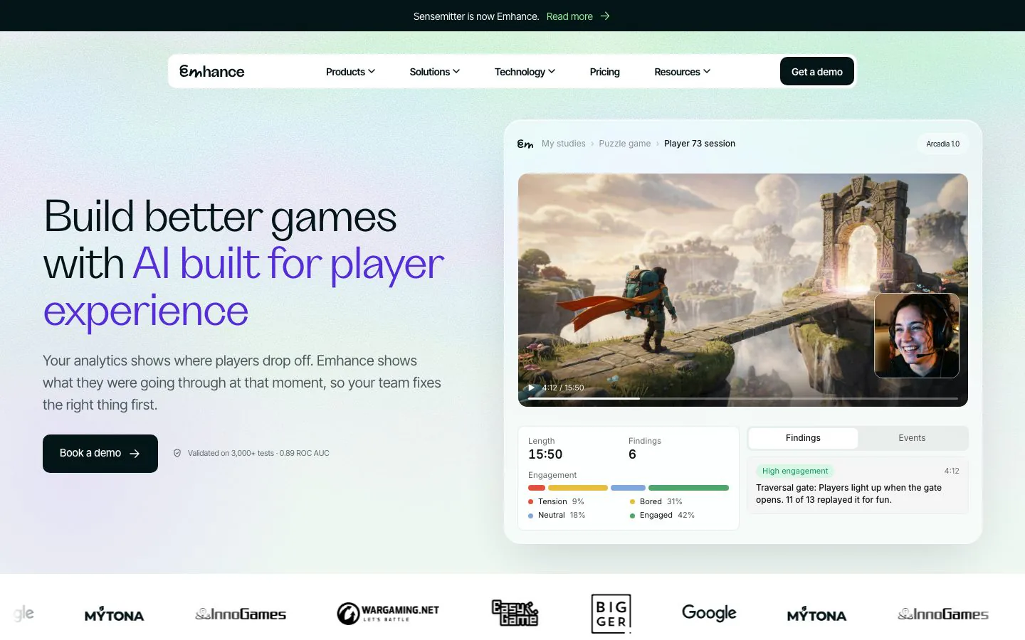
Four directions for emhance.ai
Emhance had just rebranded and settled on new positioning, but its homepage still told the old story. I designed four directions and built each one as a working prototype, so leadership could judge them in a browser with real copy and real product UI.
Project breakdown · Emhance
The brief asked for three directions: a small tweak on the current site, a frontier direction, and something outside the box. Two had to be solid enough to ship. The third was there to provoke.
I built each direction as a working page in the real codebase. Leadership could scroll each one, see real copy and product UI in place, and compare them on equal terms.
I kept the copy honest across all of them: real customer quotes only, no invented stats, and only capabilities the product actually has.
I worked with David Hartery, head of marketing, on the brief and the messaging.
The small tweak. Same structure as the live site, rebuilt in a cleaner card language with heatmap imagery from the product and a live dashboard mockup.
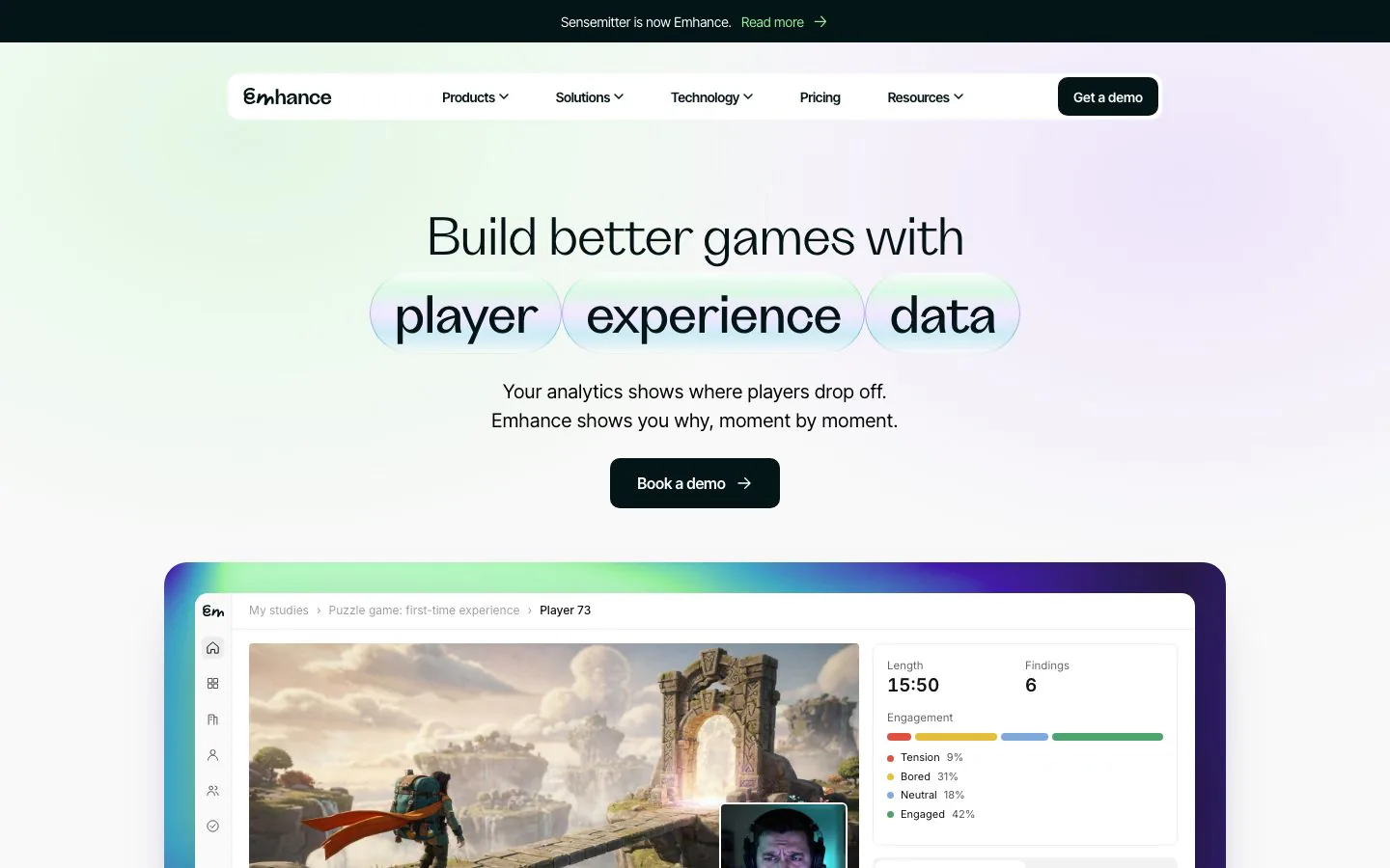
The frontier direction, built around Arcadia, the player-intelligence model. A light aurora look, product UI redrawn from the real Figma screens, and one dark cinematic moment to introduce the model.
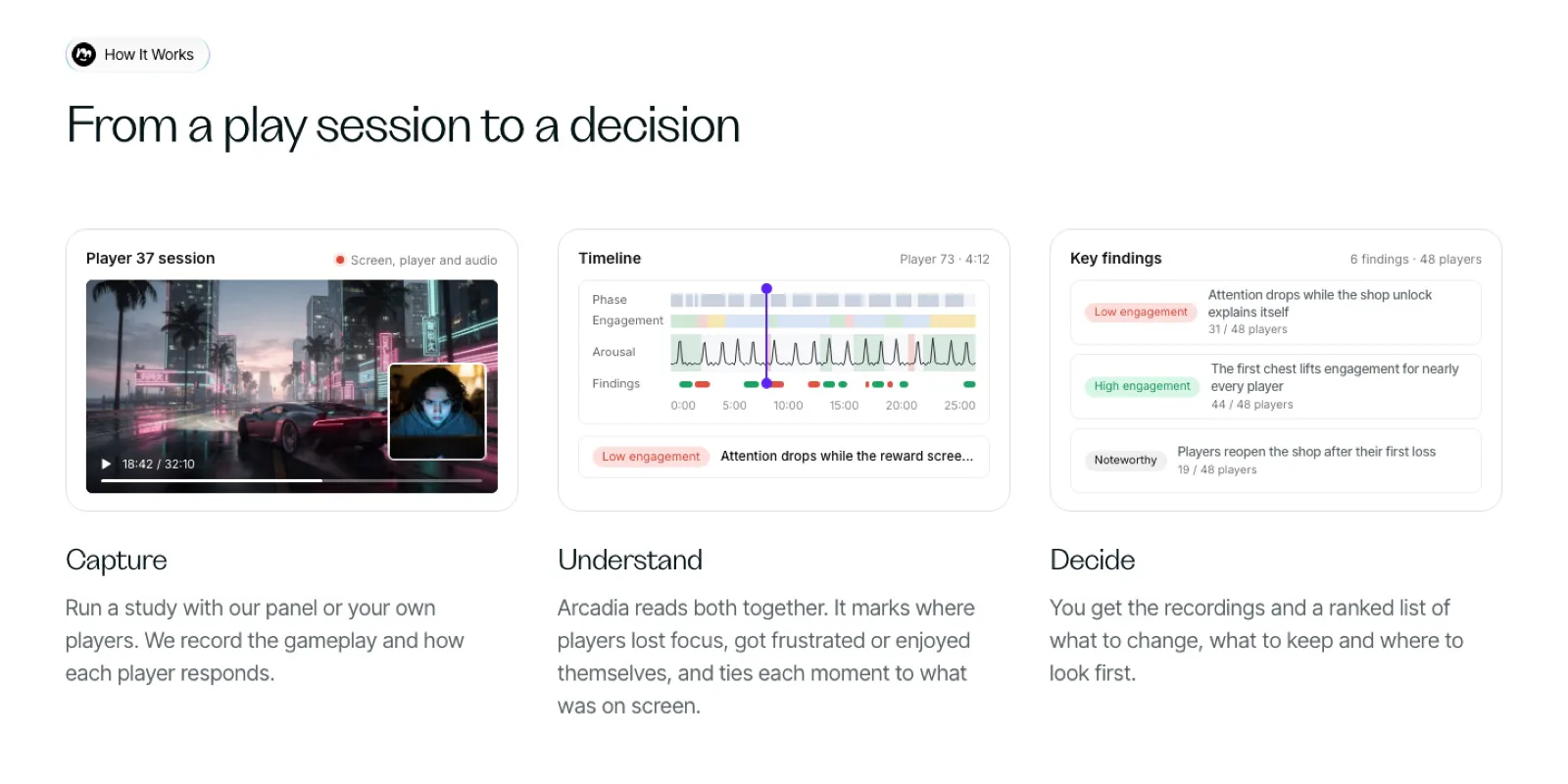
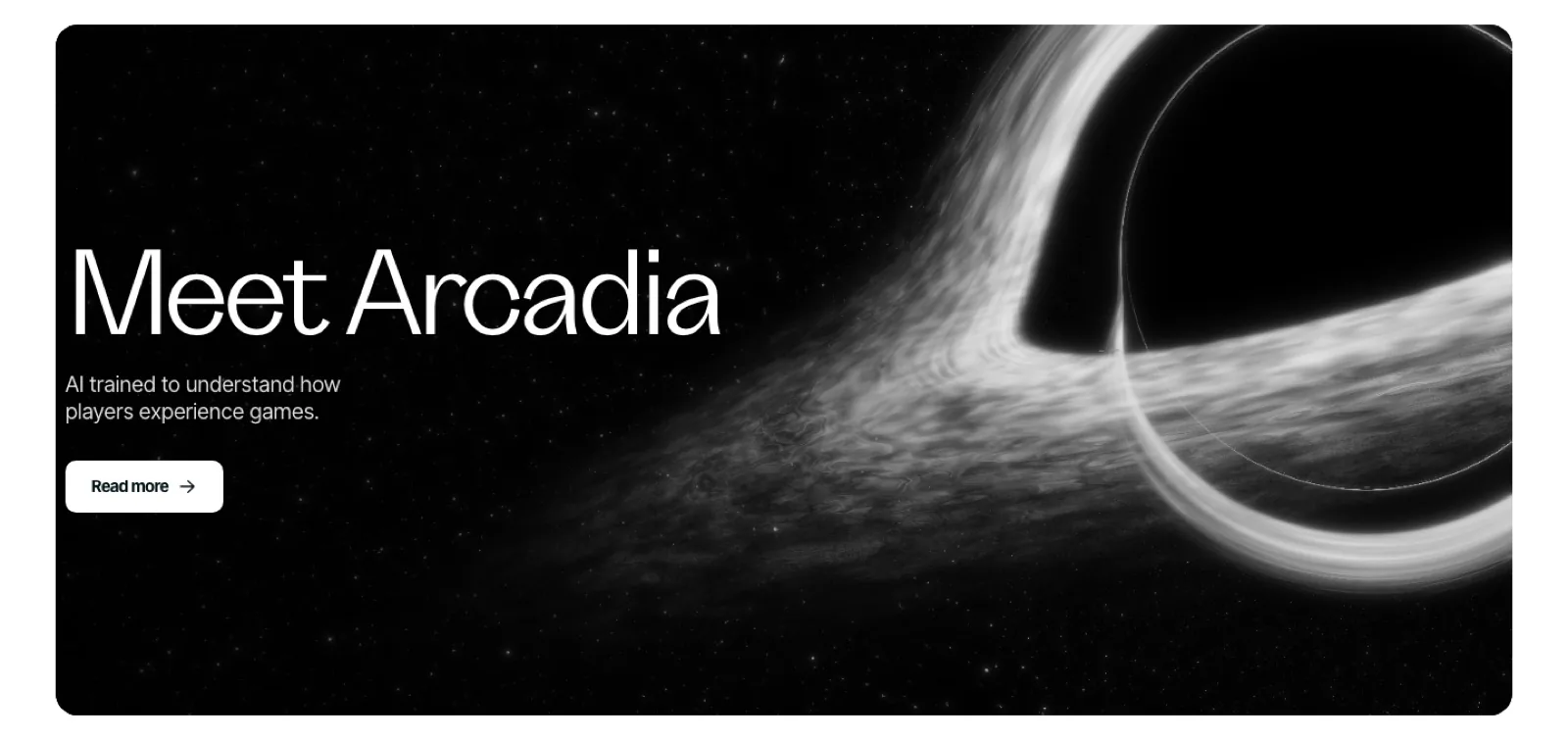
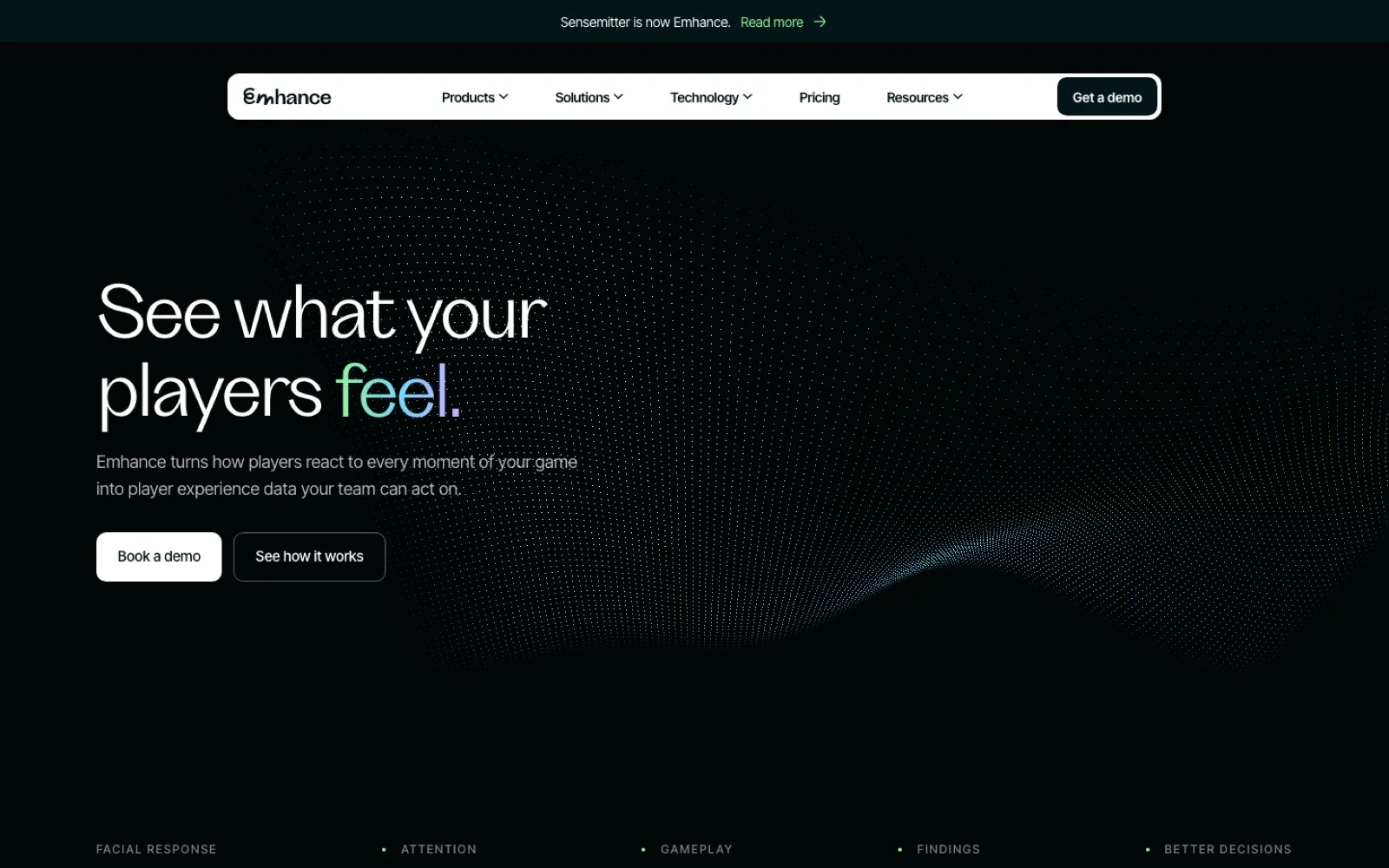
The provocation. A black page and one animated field of dots that morphs as you scroll: a wave, a cloud of feeling, a player’s face, a pulse line, then the results customers reported.
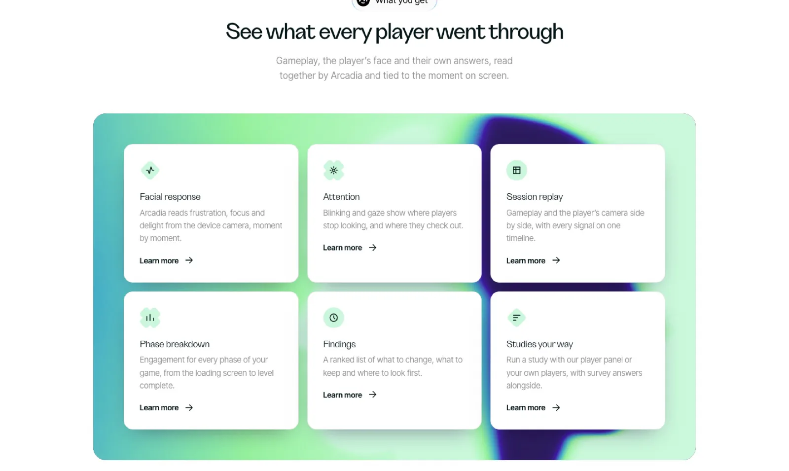
My own addition. The Arcadia hero, but only the copy scrolls: the product panel stays pinned and steps through capture, timeline, finding, comparison and decision.
I presented the directions to leadership on a single review page with scroll-through recordings of each, then on live preview links.
The directions weren’t taken forward after a change in product leadership. What they show still stands: four distinct answers to one brief, each built well enough to judge in a browser rather than imagine from a slide.
Trust and prestige for a trading card shop
Titan Cards is a UK online shop for trading cards: Pokémon, Yu-Gi-Oh!, Magic: The Gathering, One Piece and more. Customers already rated it 4.8 on Trustpilot, but its cartoon logo didn’t reflect that. I redesigned the brand, the website and the social posts that sell each new release.
Project breakdown · OneTwenty
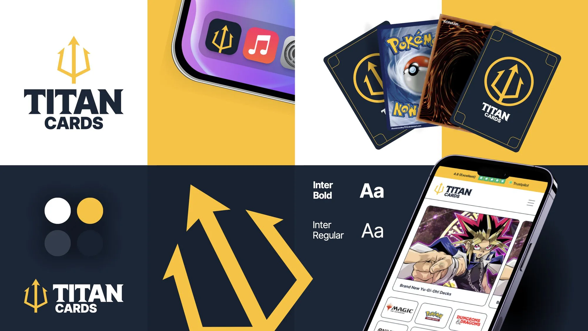
OneTwenty had just acquired Titan Cards, and its leadership asked me for a modern refresh. The brief was to make the shop look as trustworthy and premium as its reviews said it was, through a new logo and palette, then carry that into the website and social. I was the only designer on it, from the logo to the launch posts, and did it in about two months alongside my usual OneTwenty workload.
A cracked, cartoon-style wordmark with an arrow through it, over an orange gradient bar and an all-caps serif menu. It had energy, but nothing about it said trust. It was hard to read, its detail got lost at small sizes like a favicon, and there was only one version, so it couldn’t adapt to different spaces.

The old site header, June 2024, from the Wayback Machine.
A trident. It ties in with the Titan name and the shop’s ambition to be a titan of trading cards, and it works as a mark on its own. Yellow, the colour most associated with online card shops, against a deep midnight blue. The wordmark is Inter with added serifs, for a more prestigious feel, and the site uses Inter throughout.
The first concept used a lightning bolt as the mark. I took the early designs to a review with OneTwenty’s CTO, where we signed off the custom logotype and the colour palette. We also agreed the bolt wouldn’t stand out enough in a crowded market: lightning is everywhere in trading cards, not least because Pikachu is the face of so many card shops. I replaced it with the trident, developed the full identity, and presented it to the leadership team for final approval.
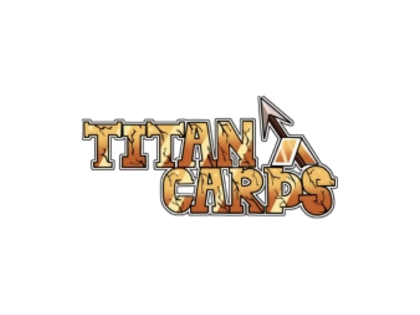
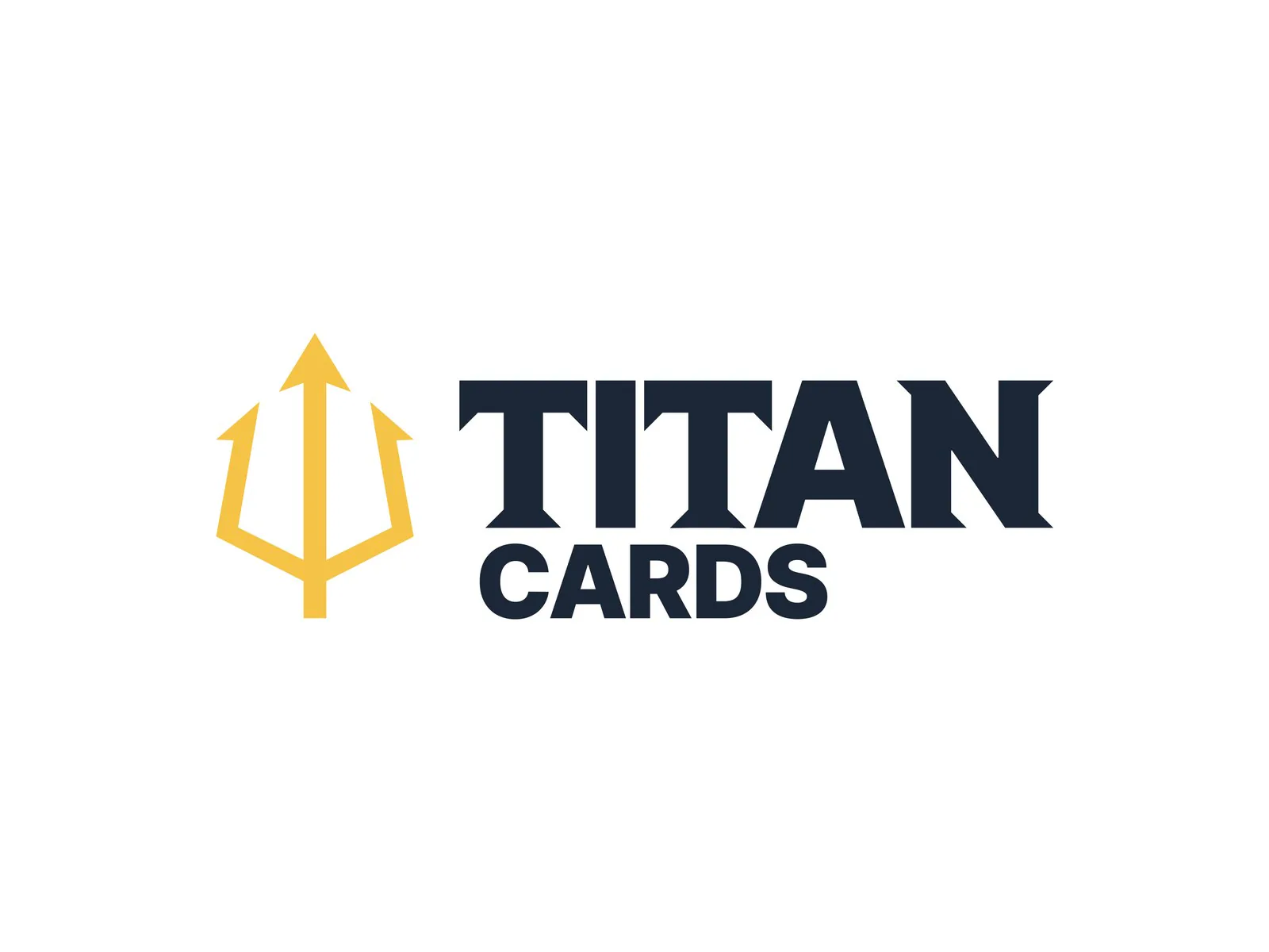
Before and after.
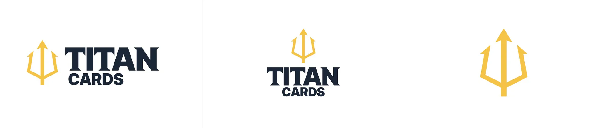
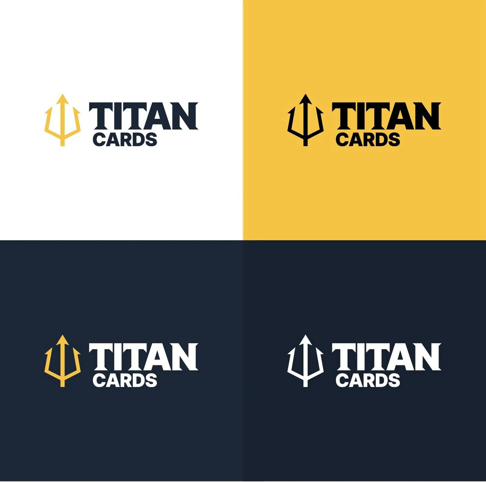
Horizontal, vertical and mark-only versions, so the logo fits a site header, a card back or an app icon. Four colours: Titan Yellow, Titan Midnight, Titan Void and white.
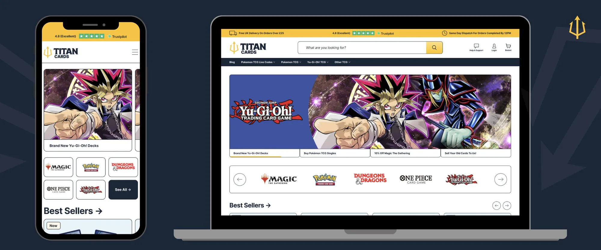
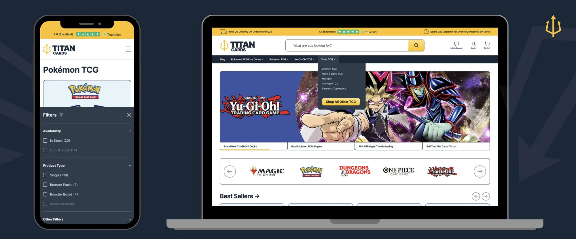
A new homepage with a hero banner for each new release, quick links to every game, and best sellers up front. Menus, filters and sorting were redesigned for mobile and desktop.
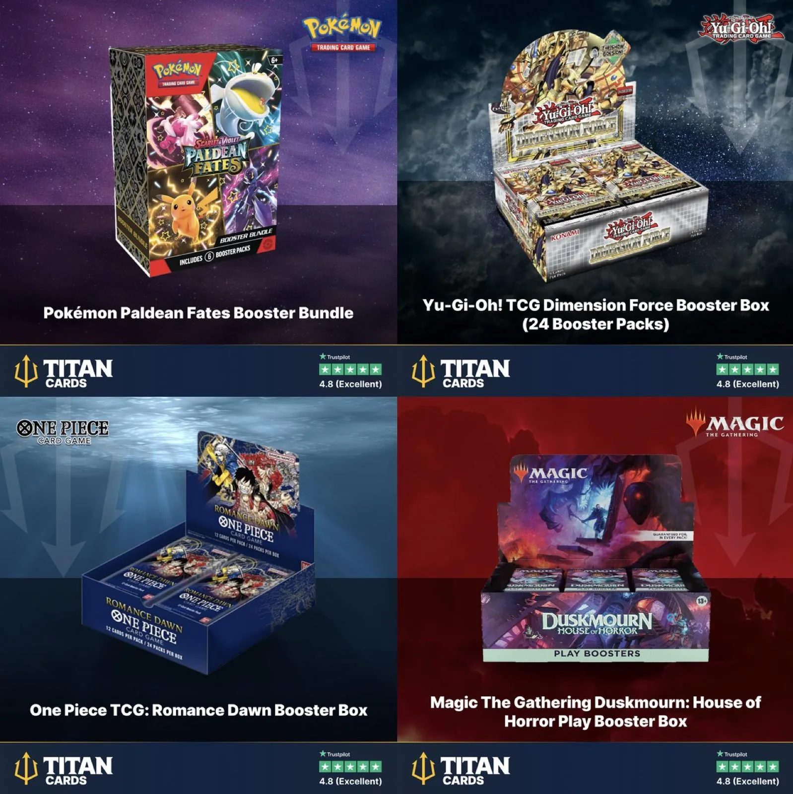
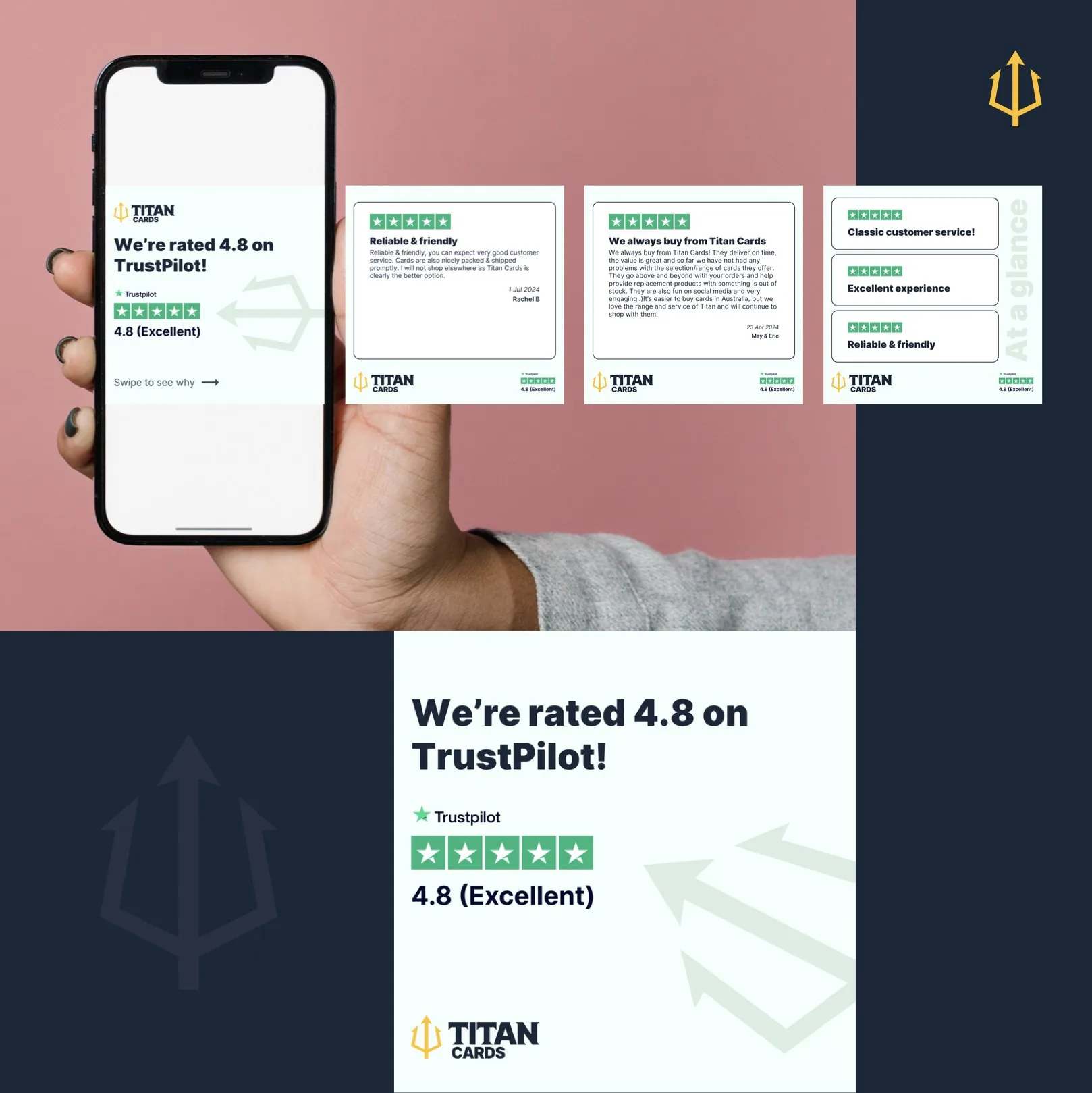
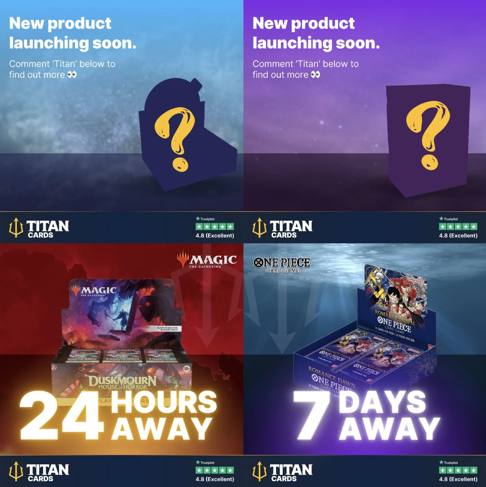
A Canva template for product posts, easy for the team to edit, with the Trustpilot score on every post. Alongside it, a review carousel and countdown posts for launches.
The new brand and site were live by October 2024.
I later carried the brand into the shop’s Amazon storefront. Two years on, the trident, the yellow and the midnight are still the identity on titancards.co.uk and Amazon.
A colour that doesn’t pick a side
Squawka is one of OneTwenty’s biggest brands: a football stats and news site with over 3.3 million followers across social. Its red identity had a problem beyond looking dated. In a league where red belongs to some of the biggest clubs, readers kept telling us the site felt biased.
Project breakdown · OneTwenty
Senior management and the Squawka team wanted it live in under three months, without touching the product. I scoped it as a full redesign of the site’s look and every social channel, keeping the product as it was, and ran it with a lean team: one designer on the site under my direction, while I built the social system myself.
The old brand, across the logo, the site and social. It had two problems. It wasn’t consistent: two versions of the wordmark, an old-school script and a more modern cut, were used interchangeably across the site and social, so it was never clear which one was the brand. And it was red: in a league where red belongs to some of the biggest clubs, it read as taking sides. A Liverpool result posted in Squawka red could pass for the club’s own account.
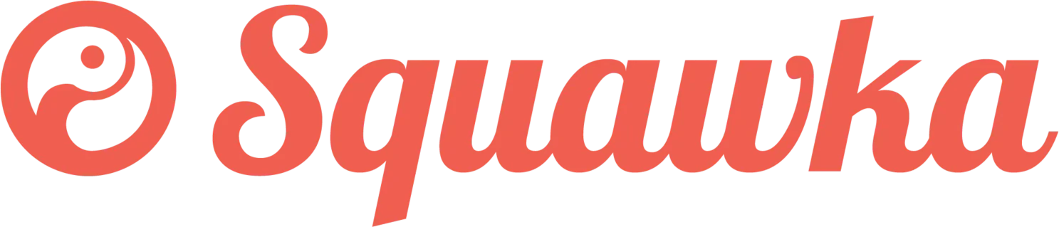
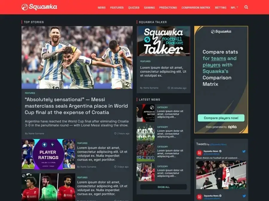
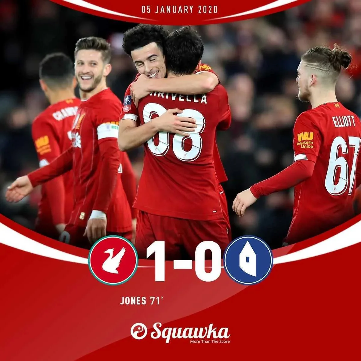
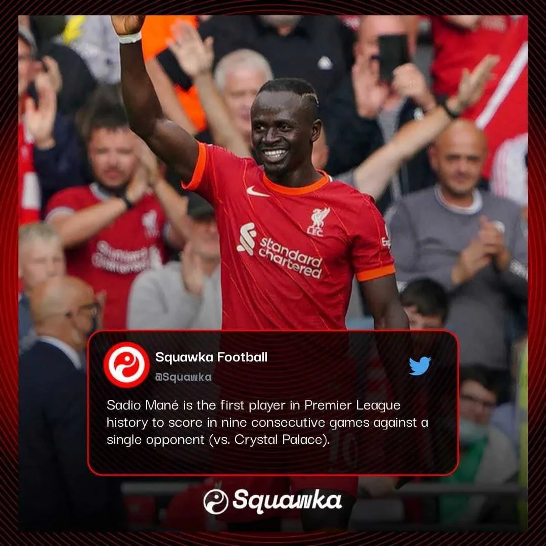
The old brand: logo, homepage and two social posts. Note the two different wordmarks on the posts.
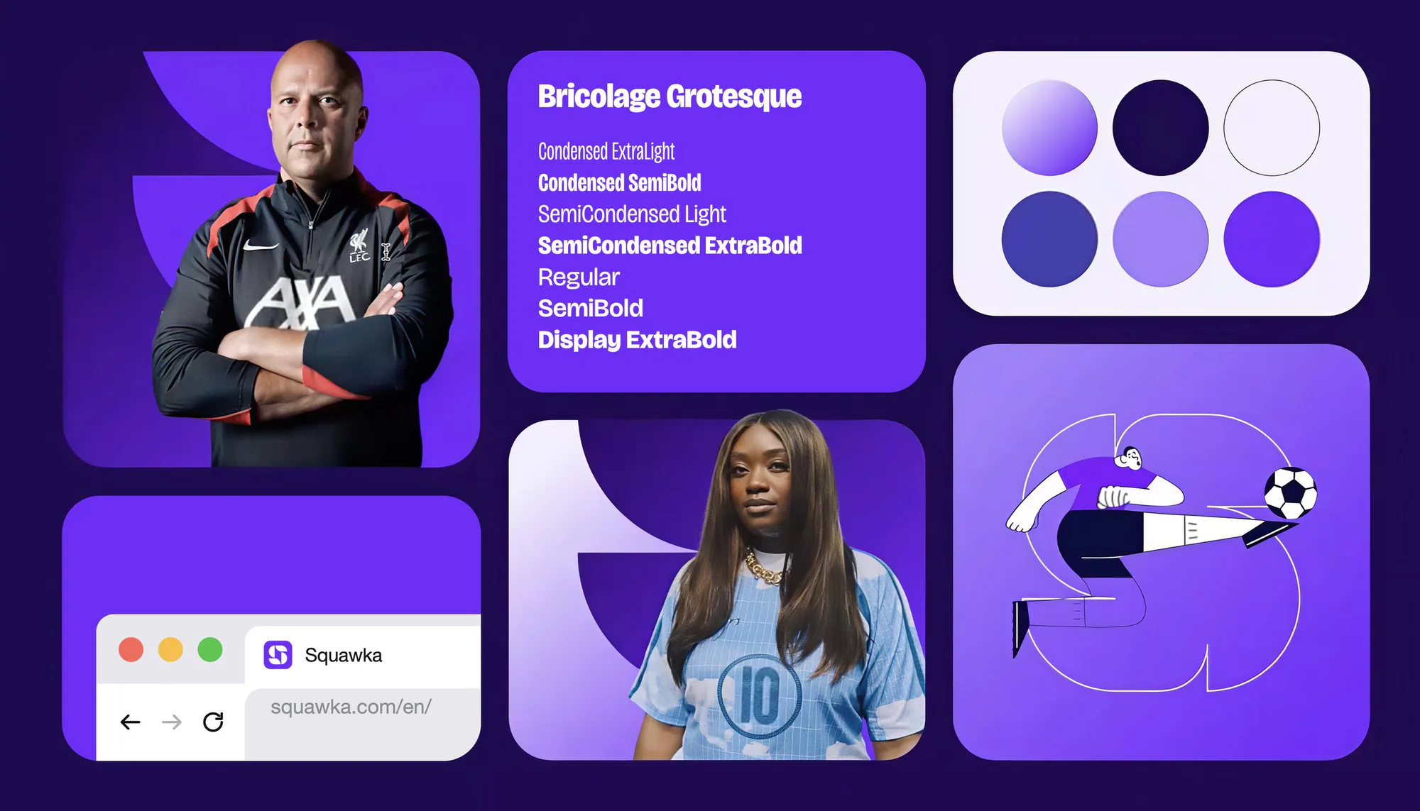
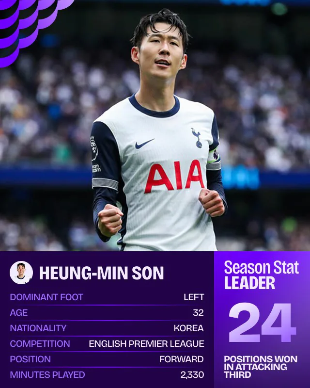
We rebuilt the brand around purple, a colour no major Premier League club owns, so the brand reads as neutral to every fan. Everything else followed from that: a new “S” mark, a bolder sports type style, and a system that could flex from a mobile site to a matchday story.
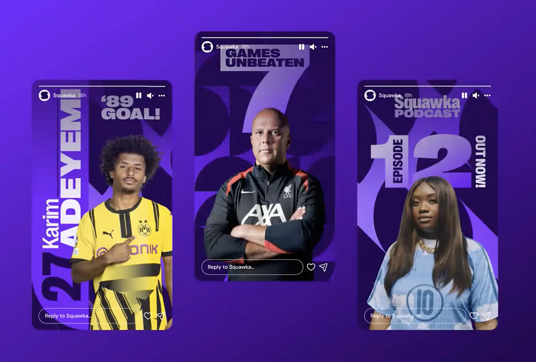
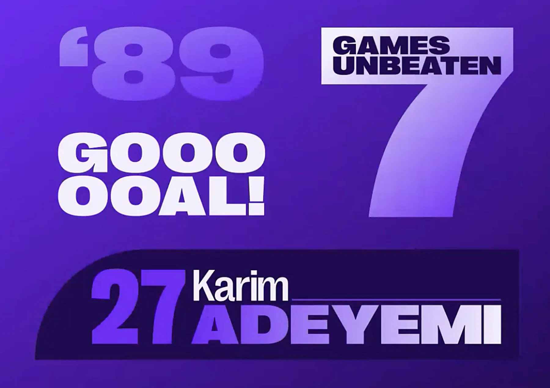
Big, loud type for the moments fans react to: a late goal, an unbeaten run, a player name, a new podcast episode.
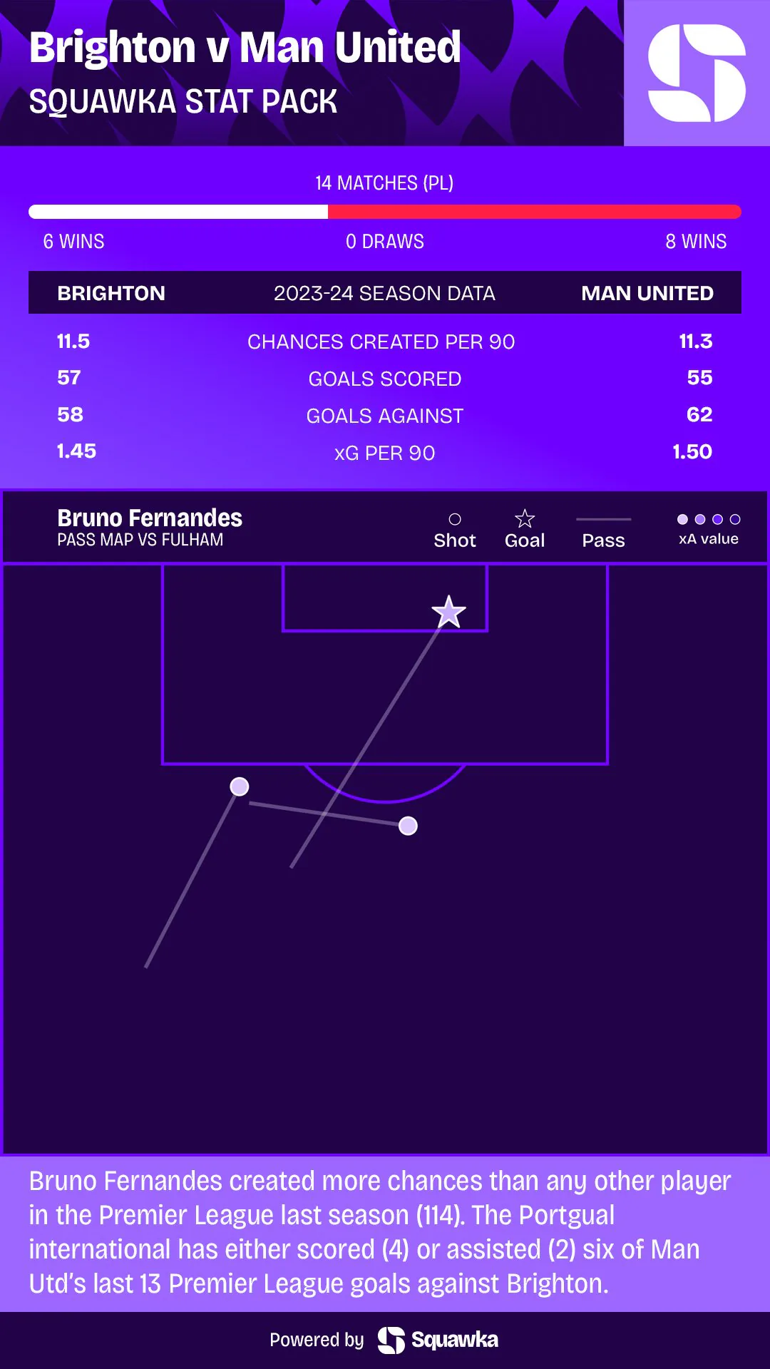
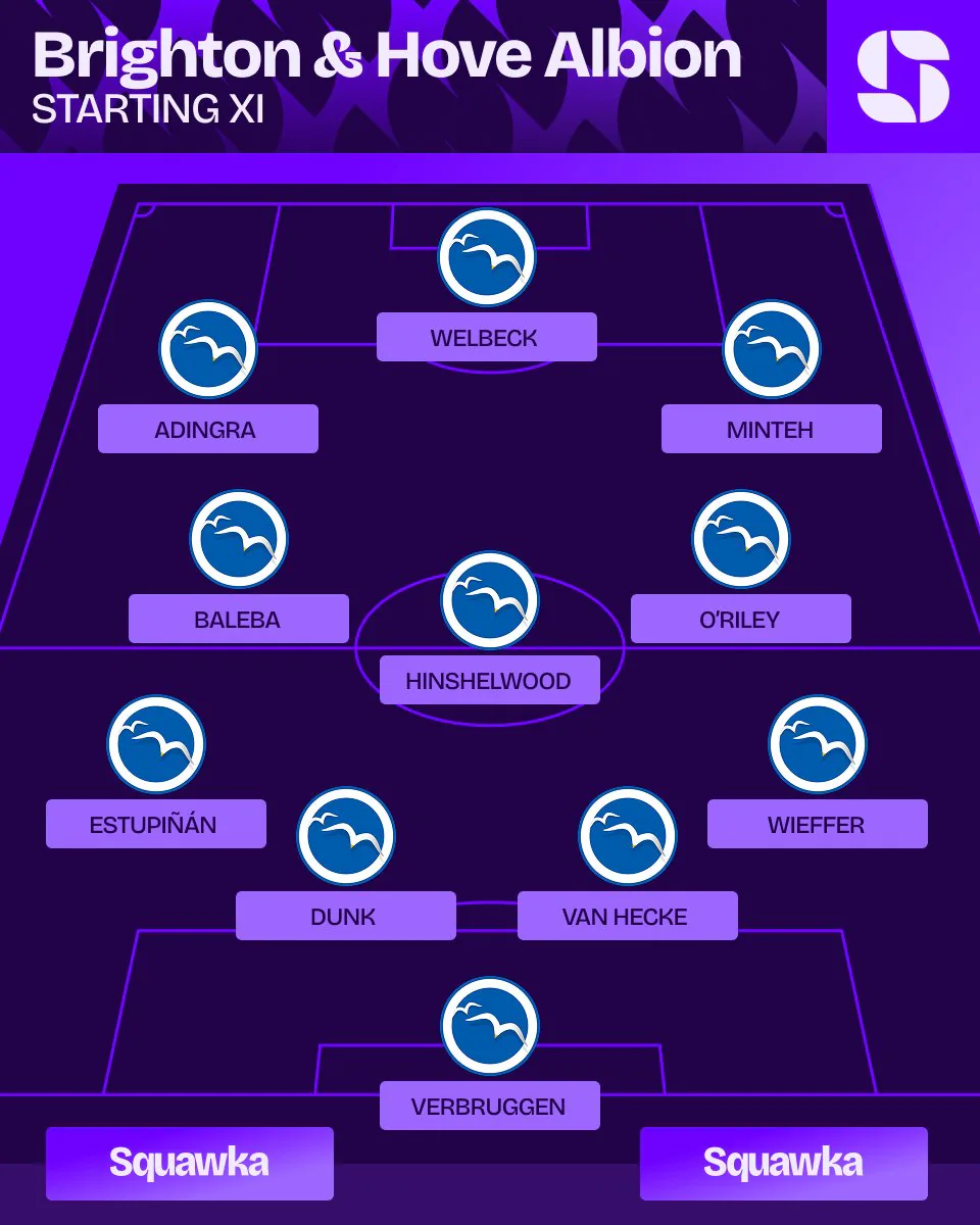
37 templates covering every matchday graphic, from stat leaders and stat lists to line-ups and match previews. I built them as reusable Figma components and designed them to be used in Twenty3 Studio, where they pull in live Opta stats, so a two-person team could keep a large football brand on-brand every matchday without designing each post from scratch.
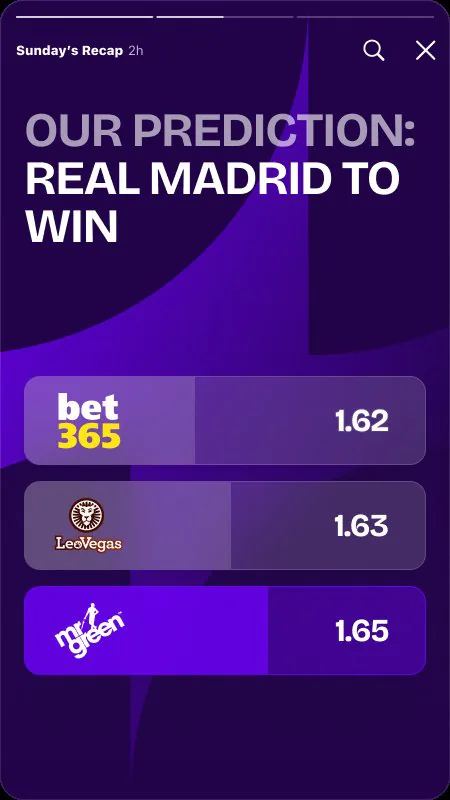
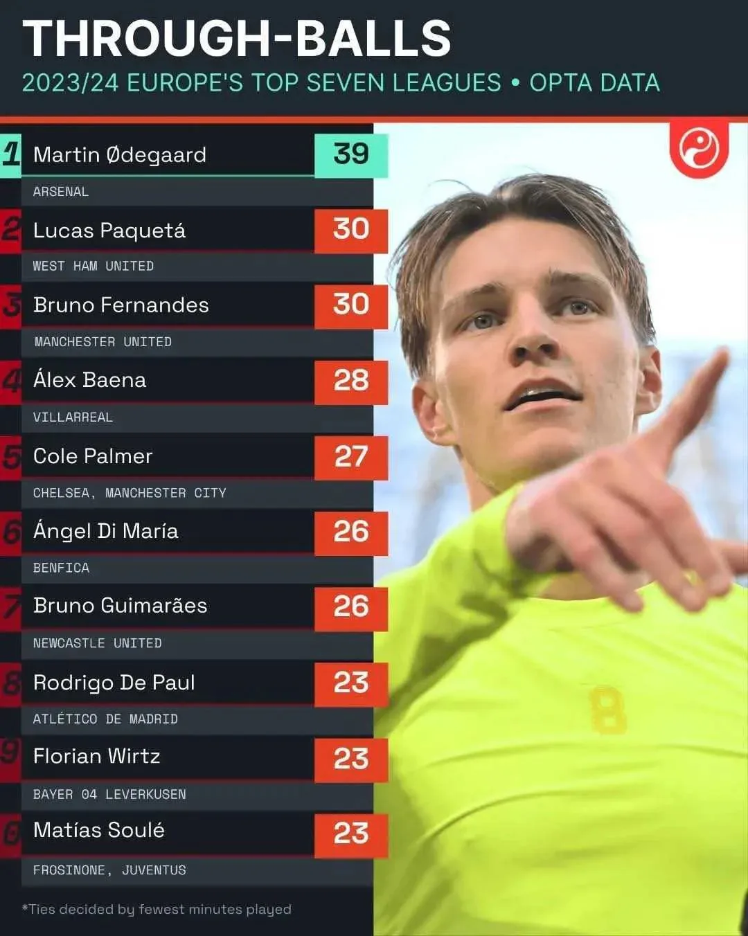
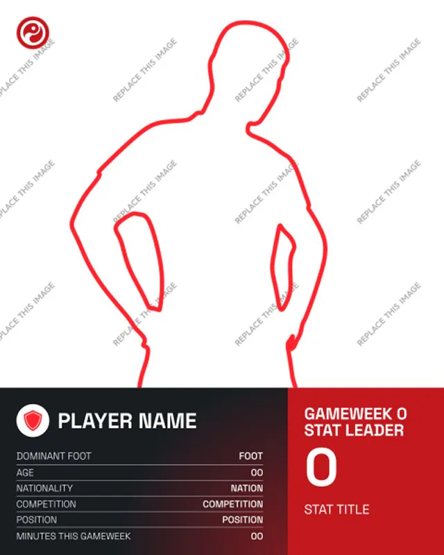
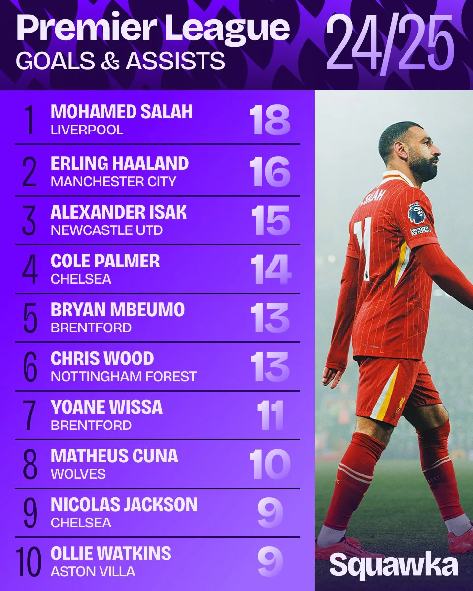
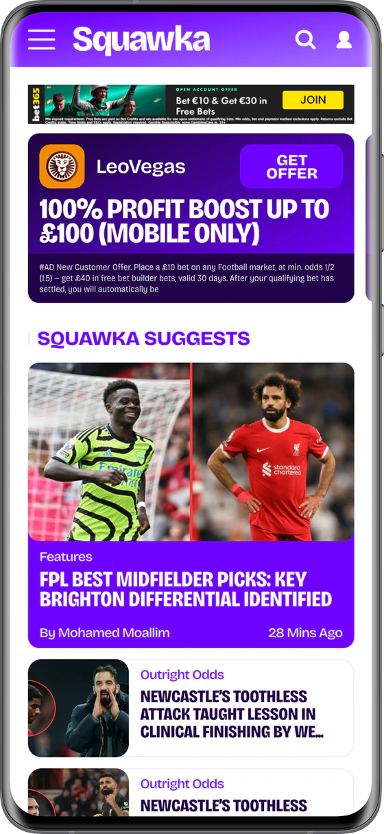
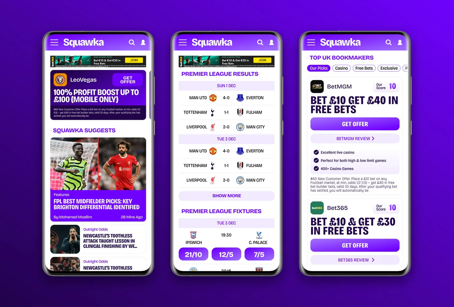
The same product, redesigned in the new system: news, fixtures and results, and the bookmaker pages that fund the site.
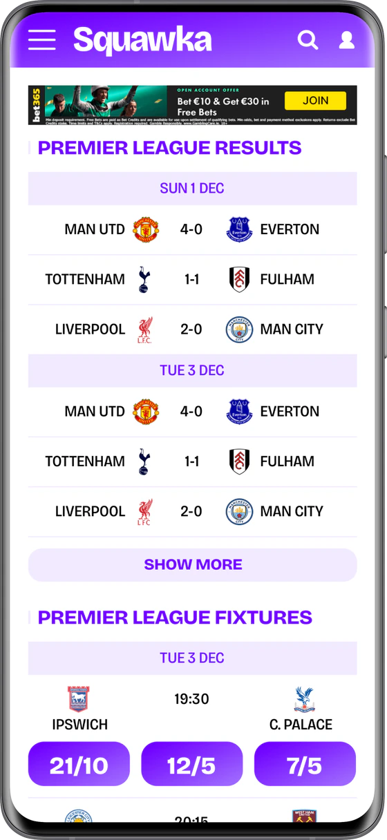
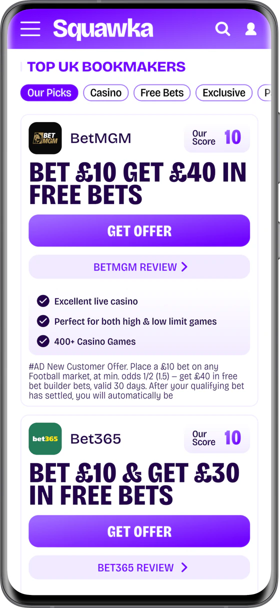
It launched on schedule in spring 2025, across the site and every social channel at once, and it became the identity for two new channels: TikTok and the Squawka Shop.
Two competing wordmarks gave way to one mark, and the 37-template system let a two-person team turn around matchday content for an audience of over 3.3 million without designing each post from scratch.
Eighteen months on, it is still Squawka’s identity.
Scores, stats and news in one app
Squawka had just rebranded, and its fans followed it across the website and every social channel. OneTwenty’s CTO and the Head of Squawka asked me to design a native app that brought live scores, Squawka’s deep stats and its news into one place. I designed it on my own, from research to a full set of high-fidelity screens.
Project breakdown · OneTwenty
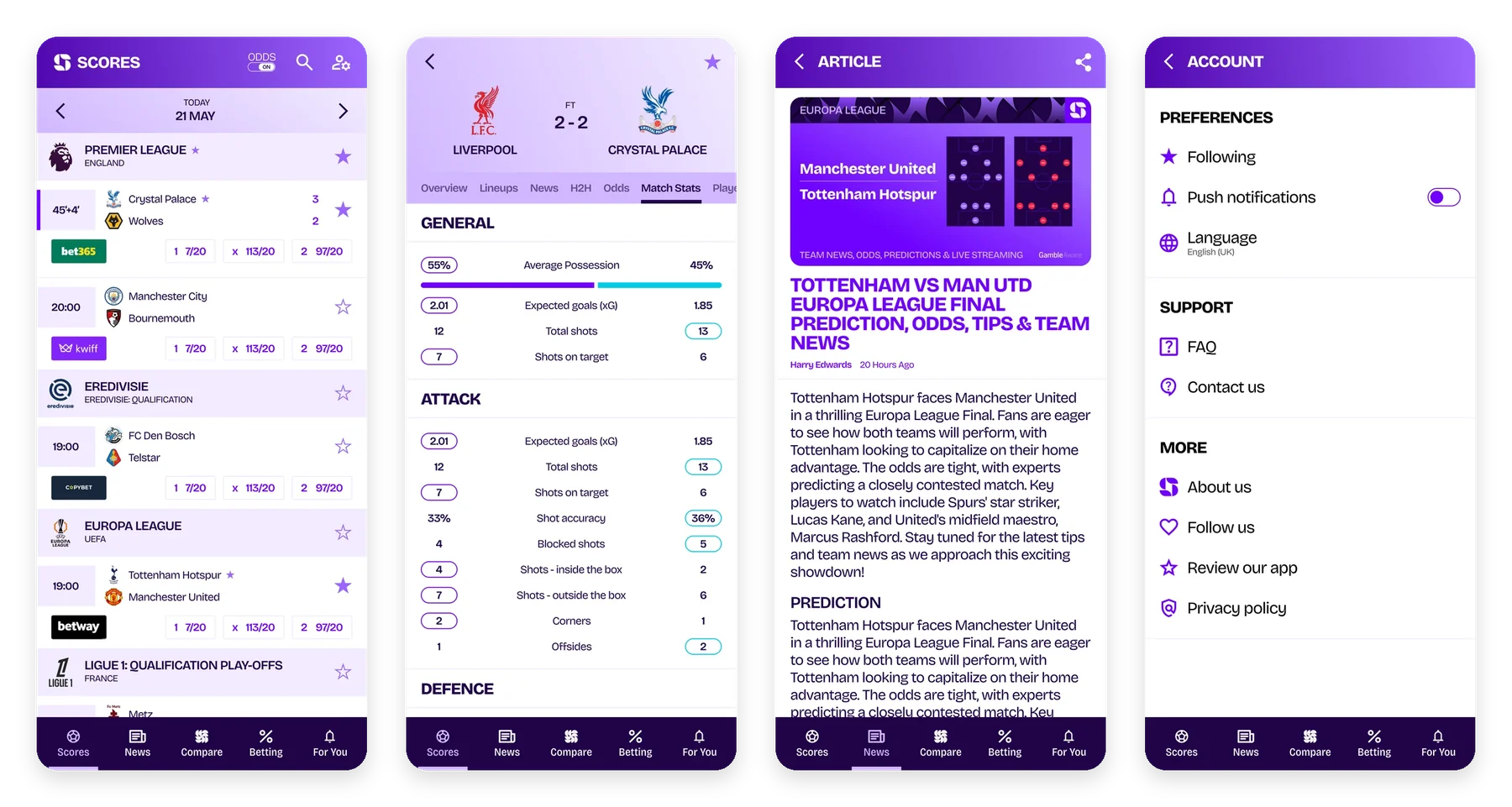
The CTO and the Head of Squawka wanted an app that felt like Squawka: stats first, built on the Opta data behind the site, in the new purple brand. It had to work for fans who bet and fans who don’t, carry the betting partners the business relies on, and give the news and video a home.
I started with the football apps fans already have on their phones: how they handle live scores, match pages and following a team. Then I looked at what Squawka could offer that they don’t, which came down to deeper stats and side-by-side player comparisons.
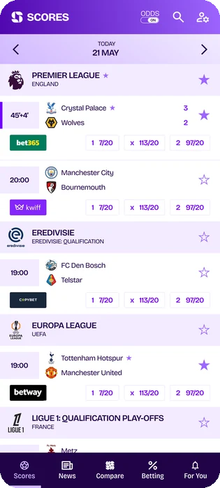
That shaped five tabs: Scores, News, Compare, Betting and For You. Starring a team, league or match feeds For You and the “Following” filter in the news.
I wireframed every screen in greyscale before any styling, around 40 in all. Competitions, matches and teams share one page pattern, with tabs for matches, table, news, odds, player stats and team stats, so a fan only has to learn it once.
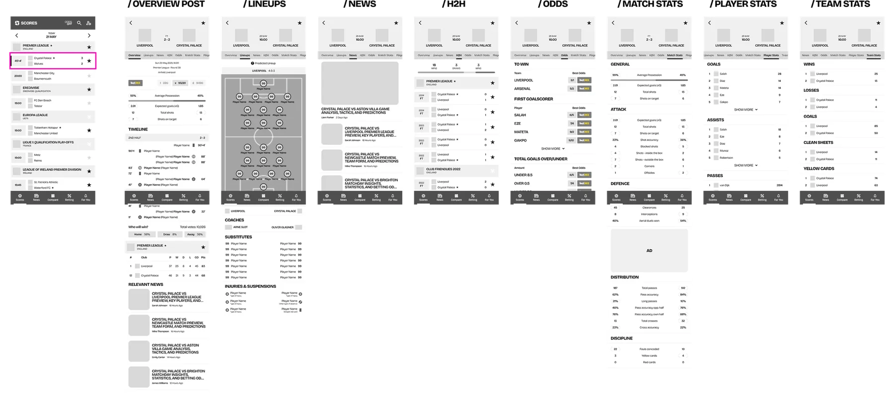
One match, eight tabs: overview, lineups, news, head-to-head, odds, match stats, player stats and team stats.
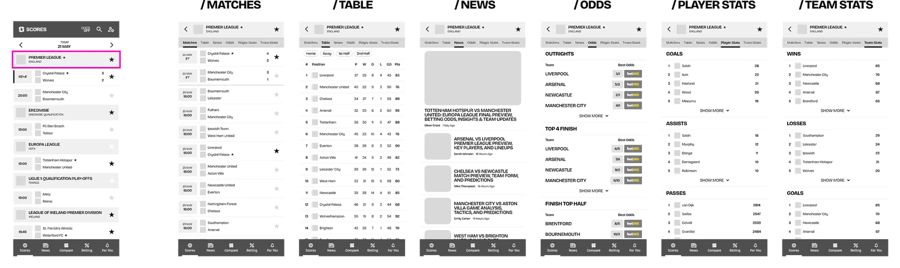
The same pattern for a competition.
The biggest call was odds. Betting partners matter to the business, but not every fan wants prices next to their scores. A toggle in the header switches odds on and off across the app, so the same screens serve both.
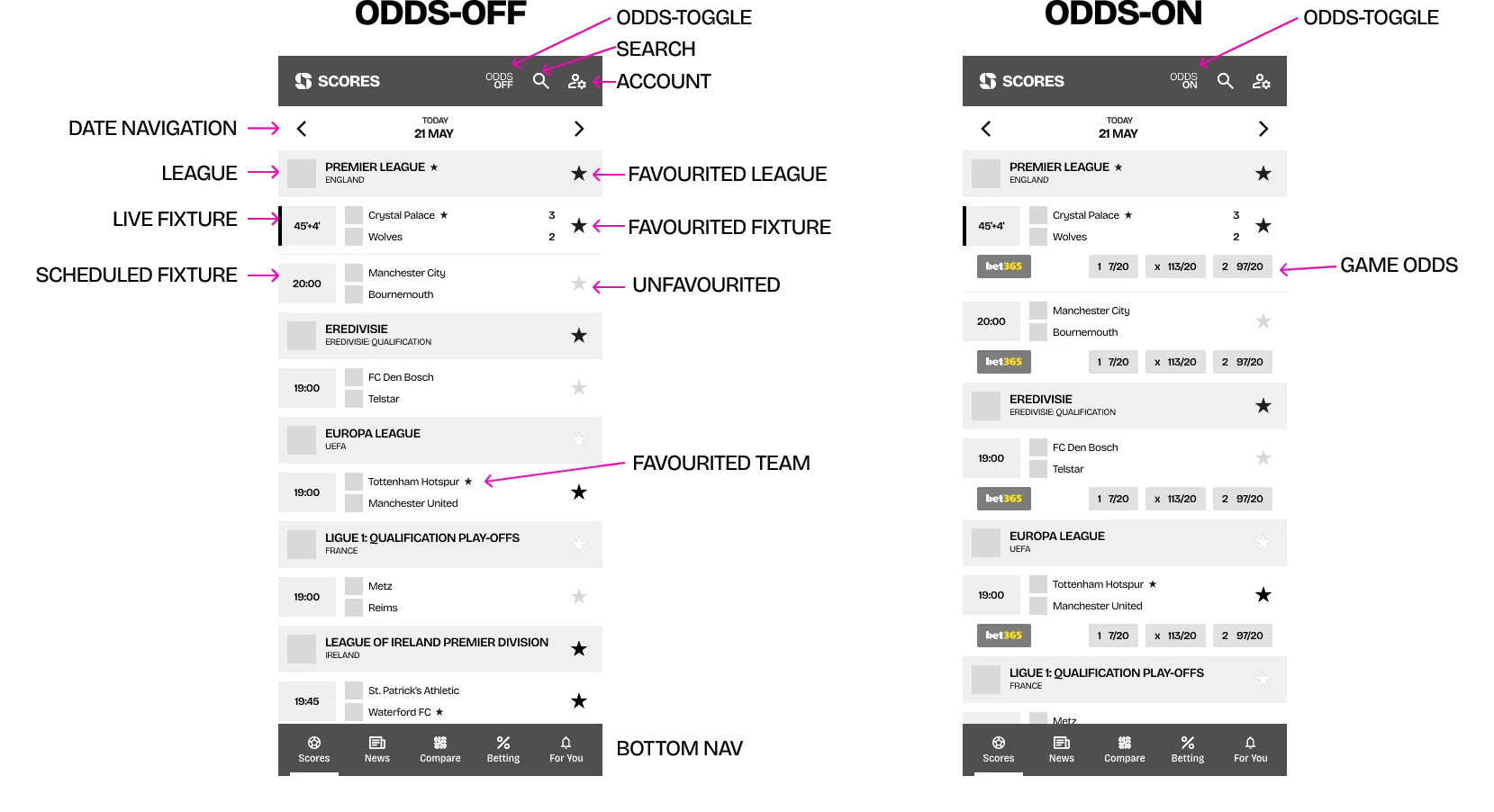
Scores with odds off and on, annotated for the developers.
As the wireframes grew I held regular check-ins with senior management, so they could see the direction and raise concerns while changes were still cheap, not at the final presentation.
Once the structure was agreed I carried the new brand into every screen: the purple, the type, club crests and coloured stat bars. I presented the full set to the CTO and the Head of Squawka as annotated boards alongside the high-fidelity mockups.
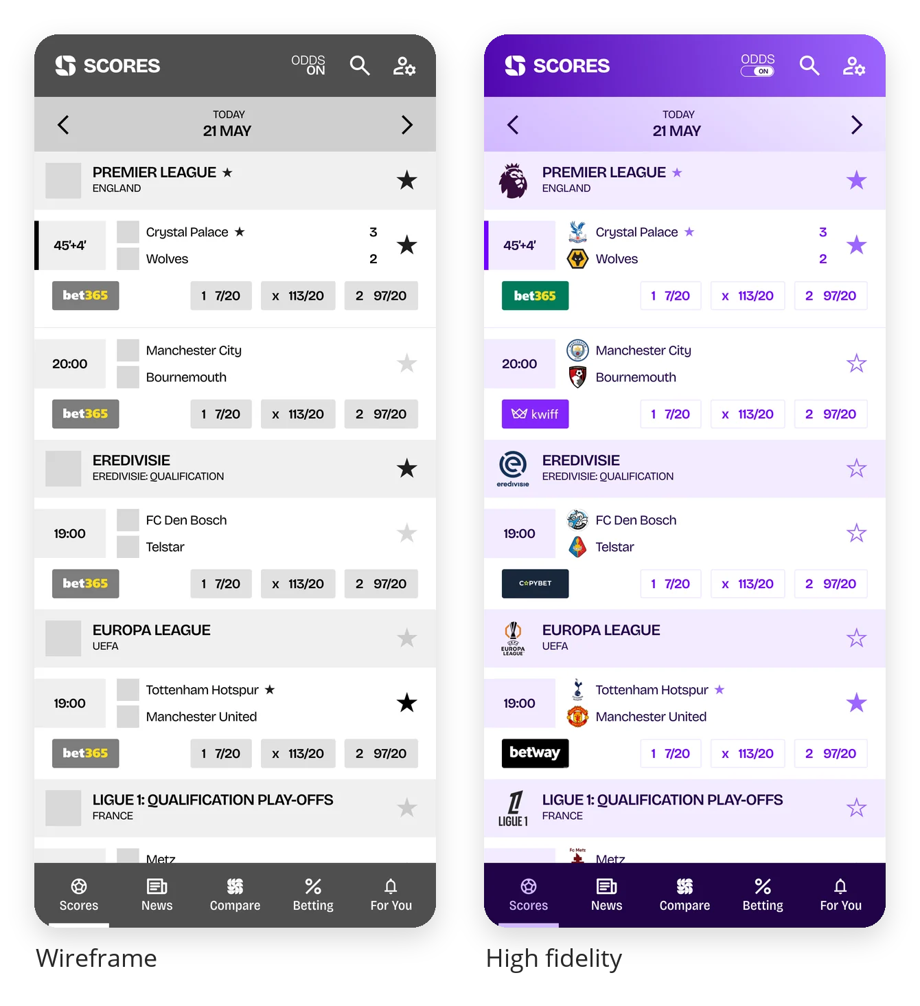
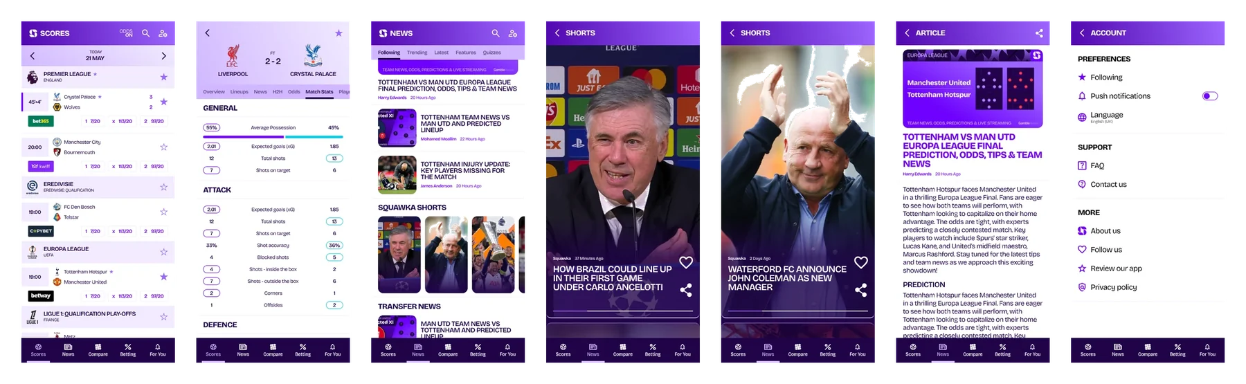
From wireframe to final, and the mockups board from the presentation.
The full set covers every screen and state, from live scores to account settings. The app hadn’t been built by the time I left OneTwenty in November 2025.
UGC-style video ads without a shoot
Emhance needed UGC-style video ads to recruit players, without paying creators or organising a shoot. Between September and November 2026 I built a pipeline that turns a made-up character into a talking-head reel, and a tool that writes the prompt for every step. It took about a dozen versions to get from a person whose room changed every few seconds to reels ready for Meta.
Project breakdown · Emhance
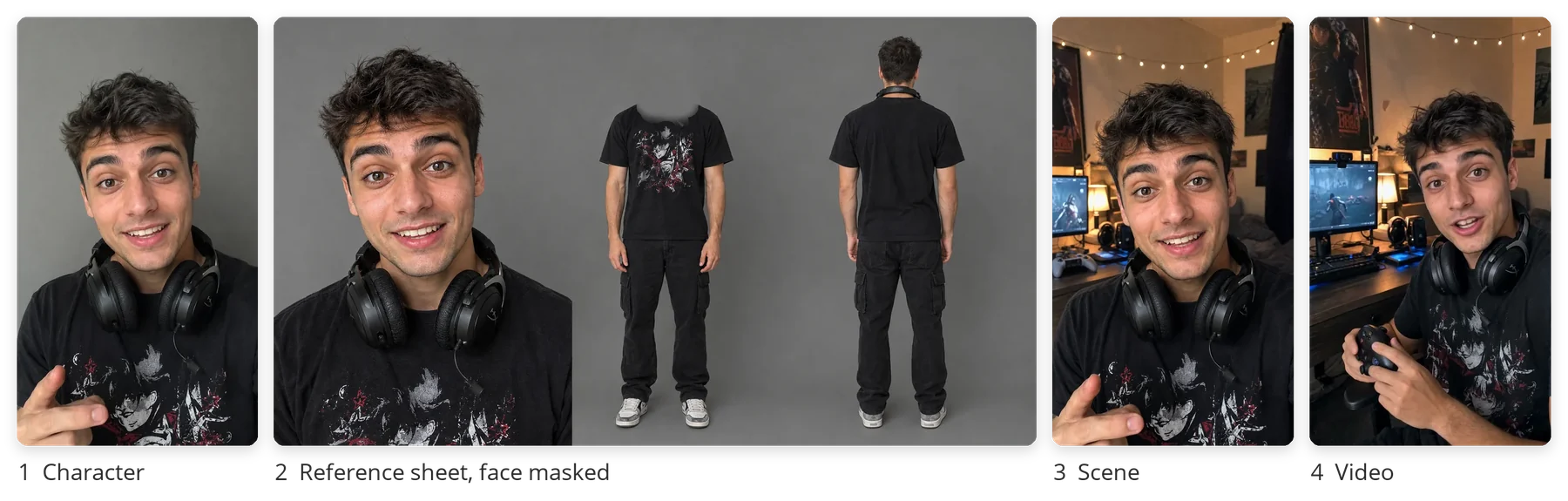
Creators cost money and take time to brief, and the ads needed different kinds of players: a console gamer, a mum who plays on her phone, a man in his late fifties. The people had to look real, stay the same from shot to shot, and cost little enough to try ideas freely.
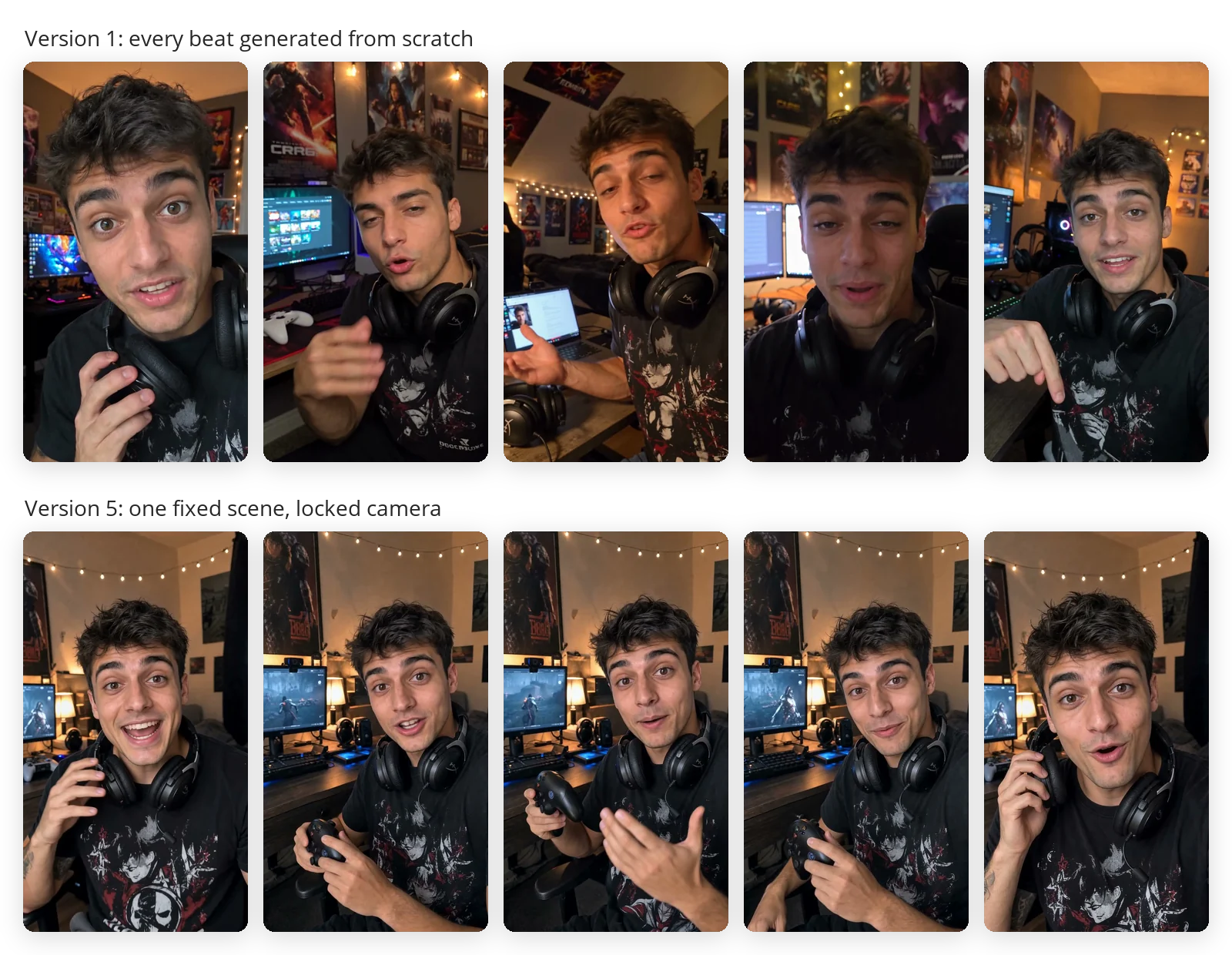
A character portrait from ChatGPT Image. A reference sheet that locks the look, made with Nano Banana 2, with the face masked on the full-body poses so only the headshot drives identity. A scene photo. Then video for each beat of the script with Seedance, through Atlas Cloud’s API, which generates the voice and the lip-sync in the same pass.
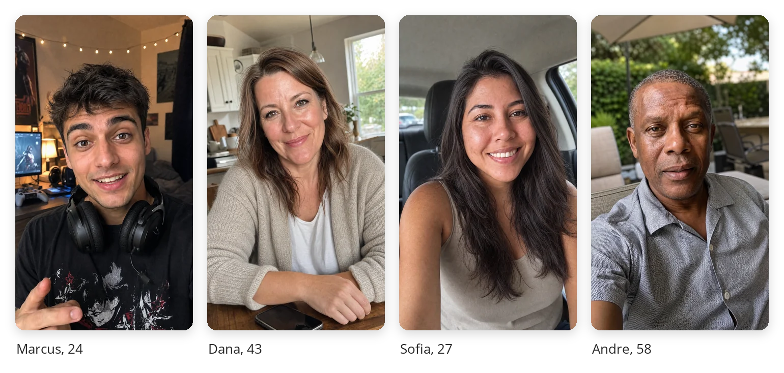
The cast, each in a fixed scene.
To make it repeatable I built the Ad Studio, a small web tool that writes the prompt for each step from a form. You describe the person once, list the poses for the sheet, block out the script beat by beat, and get ready-to-paste video prompts. Projects and a cast of characters save between sessions and export as files.
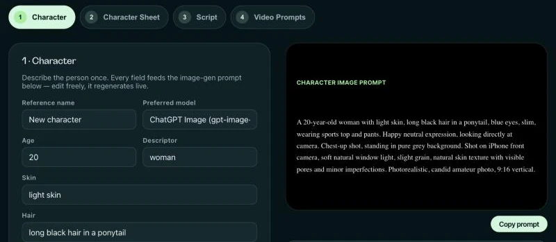
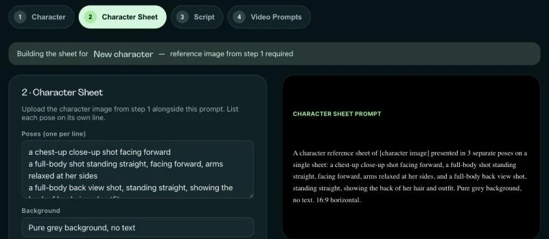
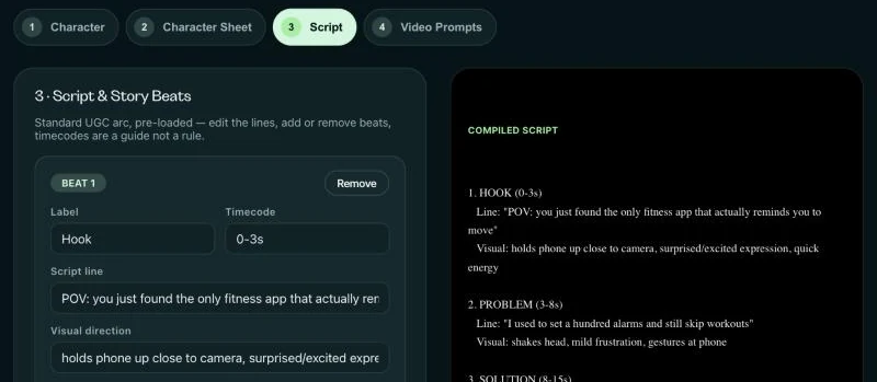
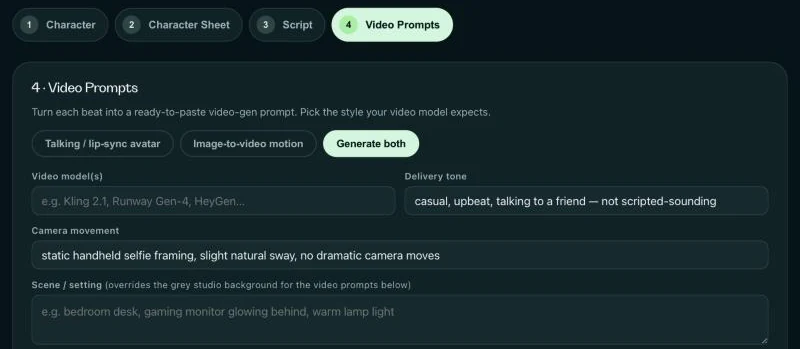
The four steps: character, sheet, script, video prompts.
The first ad cost about $10 for 29 seconds, and it looked wrong. Each beat was generated on its own from a plain studio photo, so the model built a new bedroom every time: the posters moved, a laptop appeared, the light changed. Lines were squeezed into fixed timecodes, so a 30-word line came out rushed and “webcam” became “webscam”.
Next I tried recording the voice first and animating the face to it with a lip-sync model (InfiniteTalk). That made room for a silent gameplay hook before anyone speaks, and for an ad that cuts between four characters.
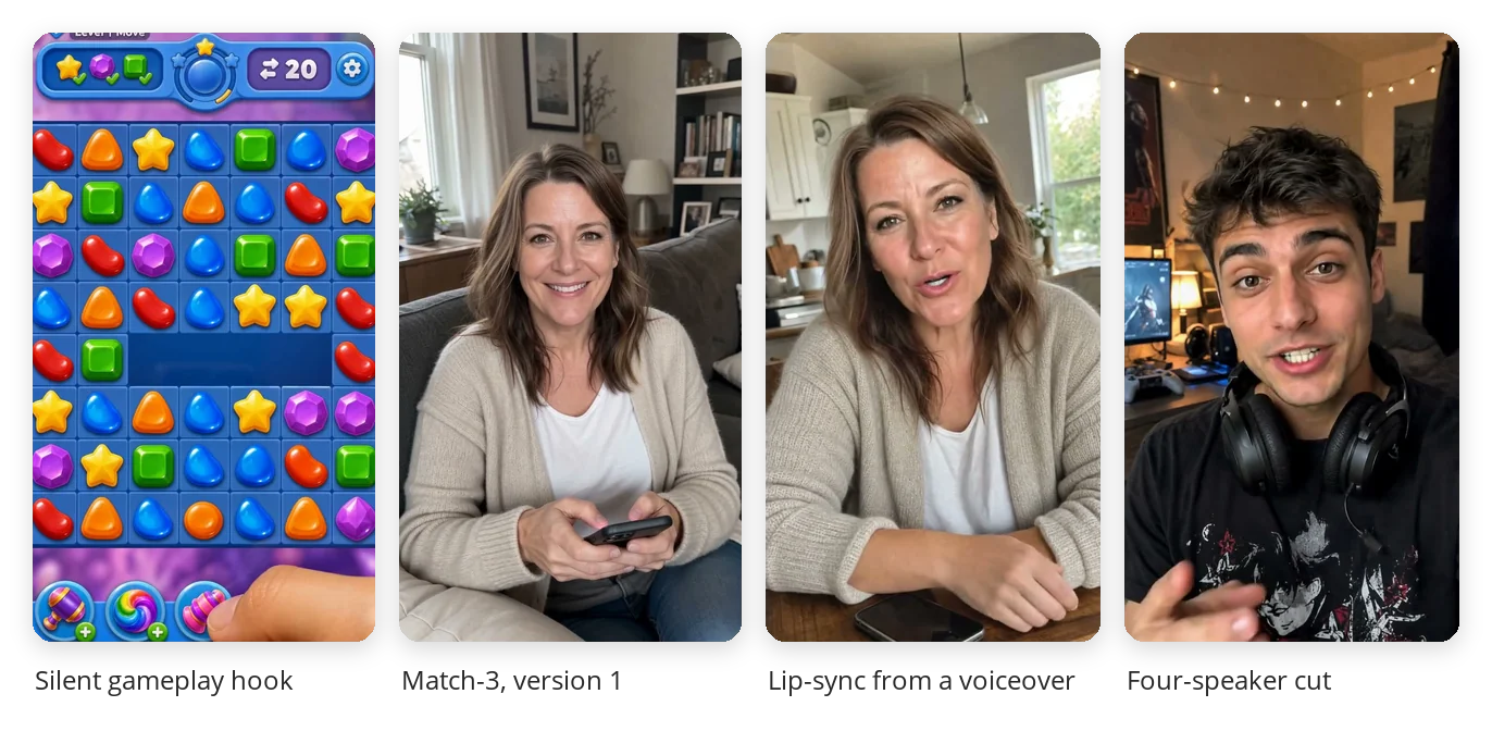
In November the pipeline made the reels for Emhance’s player app on Meta. Two rules shaped the scripts. Meta treats anything that sounds like a job as an employment ad, so the characters talk about an app, not pay. And after several tries the model still couldn’t say “Emhance”, so the name sits on screen instead.
I edited the reels in code with HyperFrames, cutting every pause and showing the real app on a phone beside the speaker.
The people are generated; the app screens are real.
Three reels handed over in November 2026. A new reel now starts from a character and a script, not a shoot, and the lessons from version 1 are built into the tool and the scripts.
Captain Spins, Casigo and Vegas Lounge
At Dream Team Gaming I was tasked with creating three new online casino brands, launched one after another. Each one needed a logo, a personality, a website, and the banners, promotions and emails that kept it going.
Project breakdown · Dream Team Gaming
Online casinos sell much the same thing: the same games from the same providers, behind similar welcome offers. What sets one apart is how it looks and sounds. My job was to give each new brand its own personality and carry it from the logo through the site, the promotions and the emails.
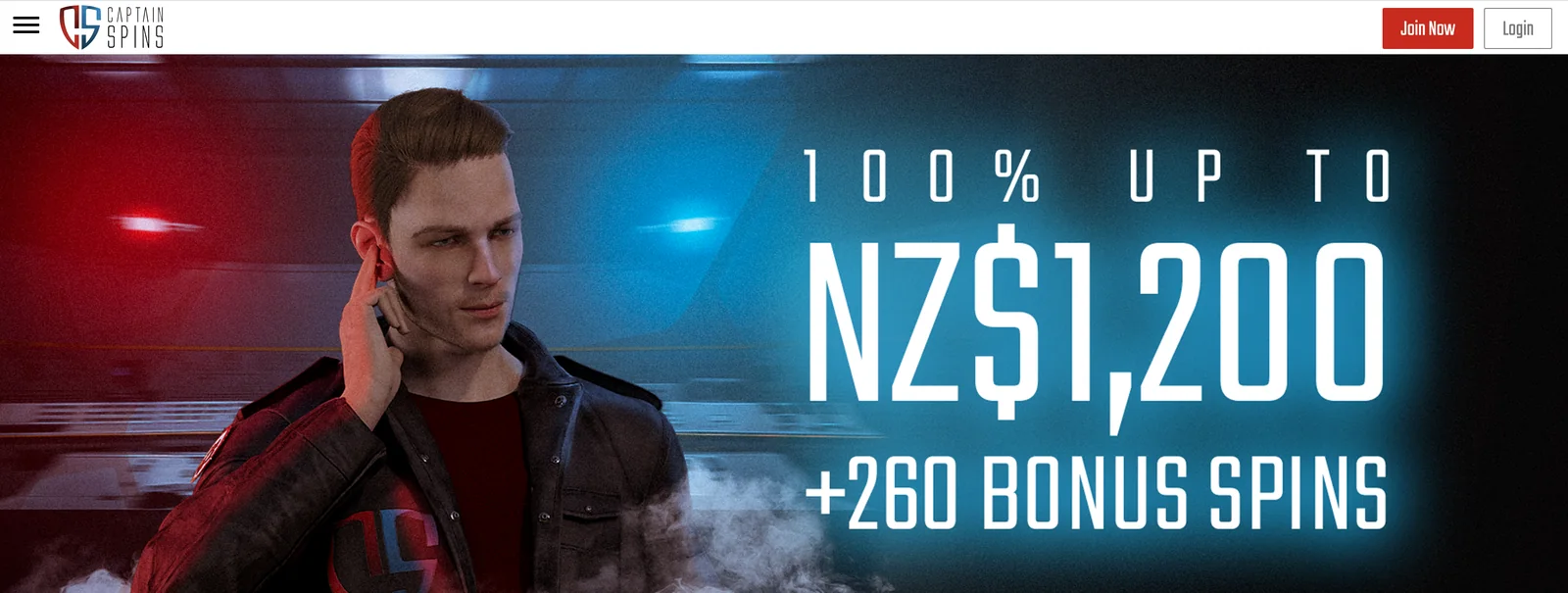
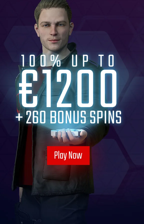
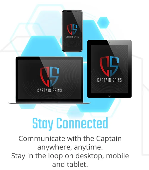
Captain Spins was built around the Captain, a secret-agent character. Everything speaks his language. Promotions are missions with a brief to read, free play is a “Trial Mission”, and the best games are “Captain’s Top Picks”.
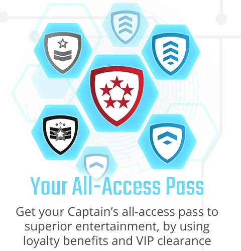
A red and blue shield monogram, tall condensed type and a hexagon motif tie it together, from the landing pages to the loading animation.



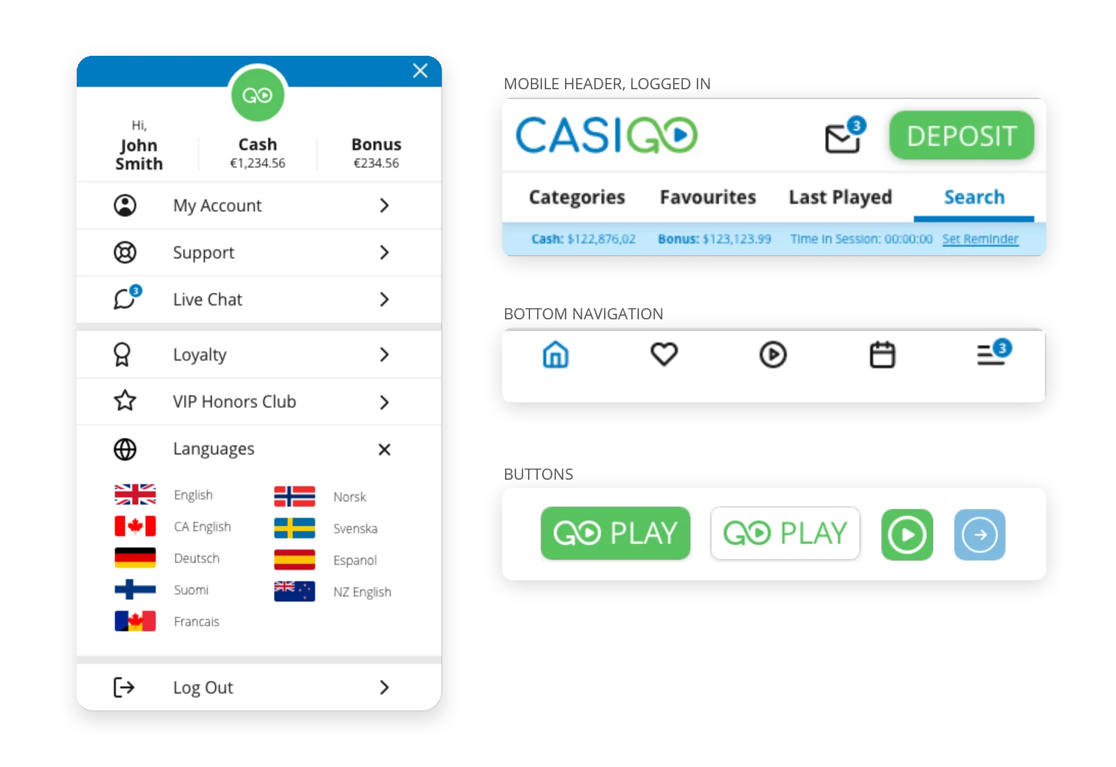
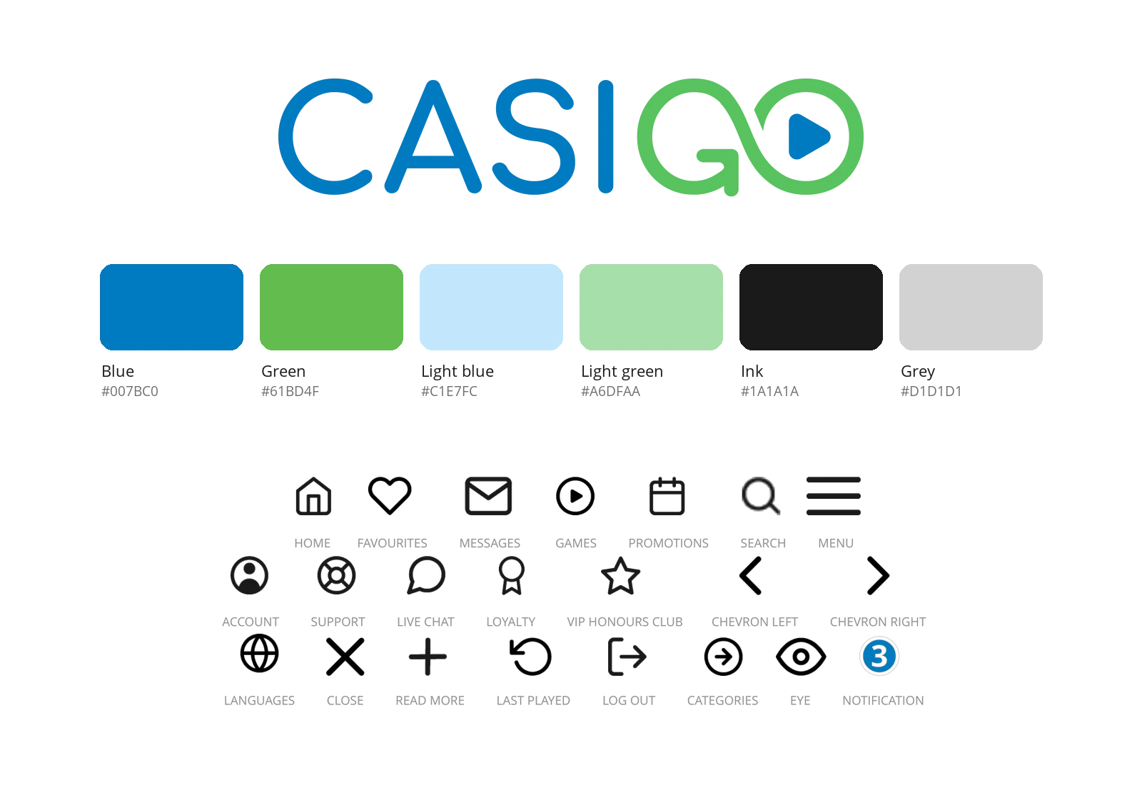
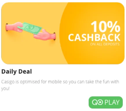
Casigo launched in autumn 2020 and went the other way. Most casino sites are loud and crowded, so Casigo stayed clean and white and let the game art do the talking. The name joins “casino” and “go”, and the G doubles as a play button. The GO idea runs through the copy too: “Casino? No, CasiGO”, “GO Spin”, “GO Play”.
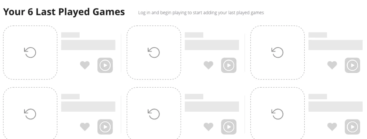
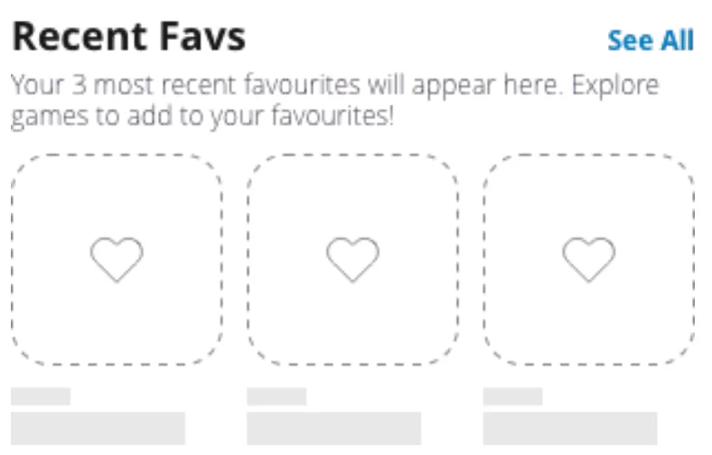
I designed the brand and the website: the logo, the palette, an icon set, the buttons, and the screens for logged-in and logged-out players on mobile and desktop. On mobile the navigation sits at the bottom, icons only, like the social and streaming apps players already use.
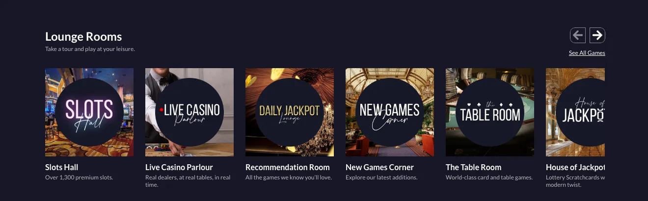
Vegas Lounge was the upmarket one: dark and calm, with a serif monogram and a handwritten “Casino”. The site is laid out like a venue. Game categories are rooms, from the Slots Hall to the Live Casino Parlour and the Table Room, each with a neon-style sign. The welcome offer is just as plain: “No Wager. No Fuss. 50% Cashback.”
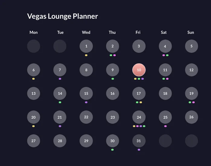
The Vegas Lounge Planner took Casigo’s promotions calendar further. Each day of the month shows its offers as coloured dots, one colour per type, from cashback to tournaments.
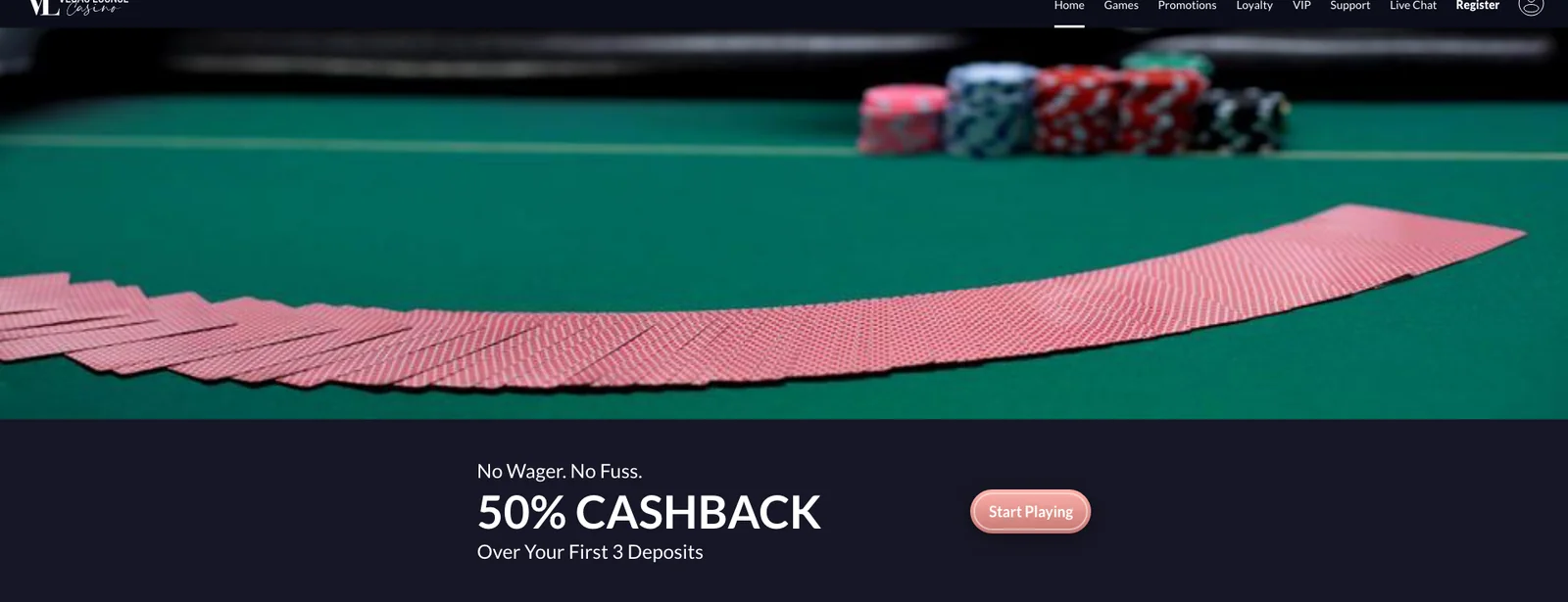
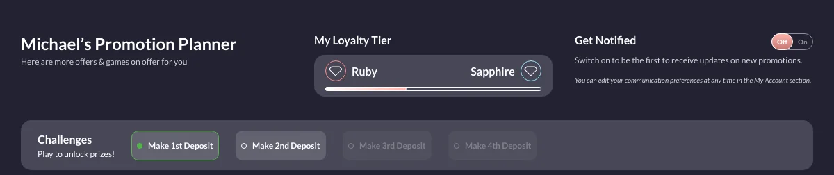
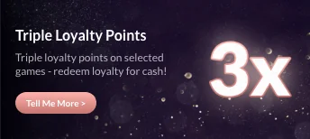

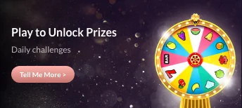
The three brands ran on the same kind of platform. I reused what worked, like the promotions calendar, the logged-in header and the mobile navigation, and changed what players actually notice: the name, the voice, the colour and the mood.
All three brands went live and ran until March 2026, when their operator stopped trading.
 Emhance
Four directions for emhance.ai
A refresh, a forward-looking direction, a provocation and a product-led story, each built as a working prototype.
See the project breakdownTrust and prestige for a trading card shop
A new identity for a UK trading card shop, carried through its website and social. Still live today.
See the project breakdown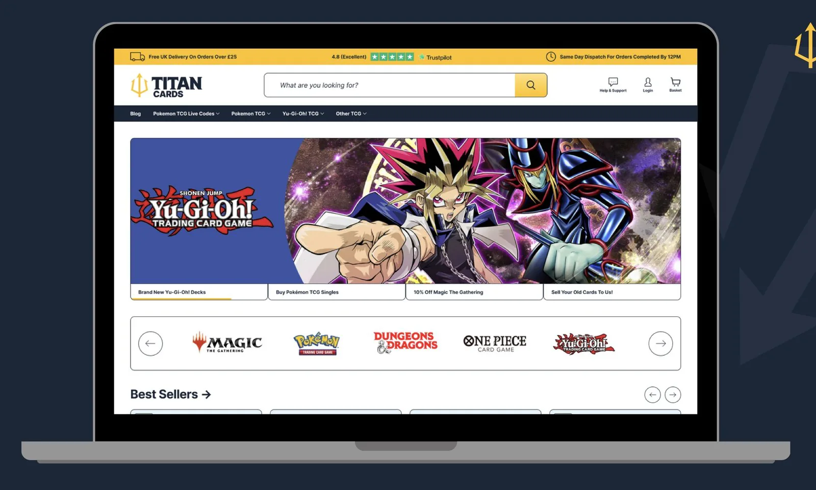
A colour that doesn’t pick a side
A new identity for a football stats and news brand with over 3.3 million followers, rolled out across the site and every social channel, with a 37-template matchday system.
See the project breakdown
Scores, stats and news in one app
A native app for a football stats brand, designed on my own from research and wireframes to a full set of high-fidelity screens.
See the project breakdownCaptain Spins, Casigo and Vegas Lounge
Sole designer on three launches in a row, each with its own personality: a secret-agent casino, a clean one that lets the games lead, and an upmarket lounge.
See the project breakdownUGC-style video ads without a shoot
A pipeline and a prompt tool for AI talking-head ads, from a first version that rebuilt the room every few seconds to reels ready for Meta.
See the project breakdown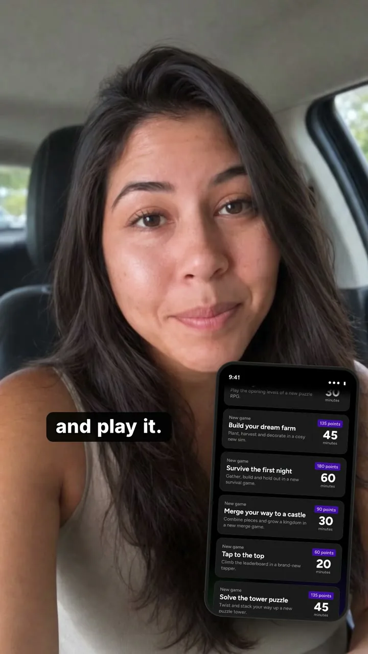
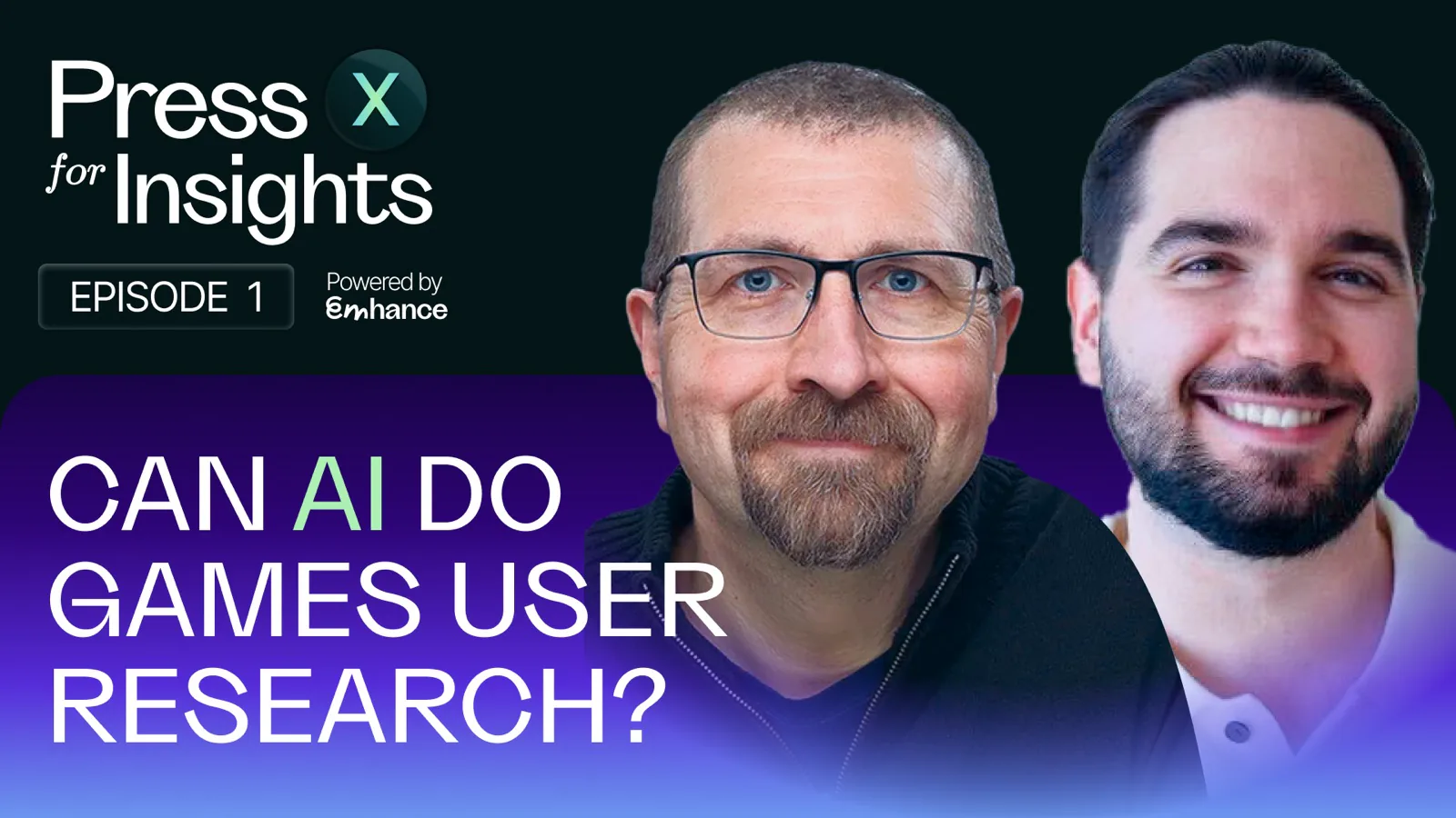
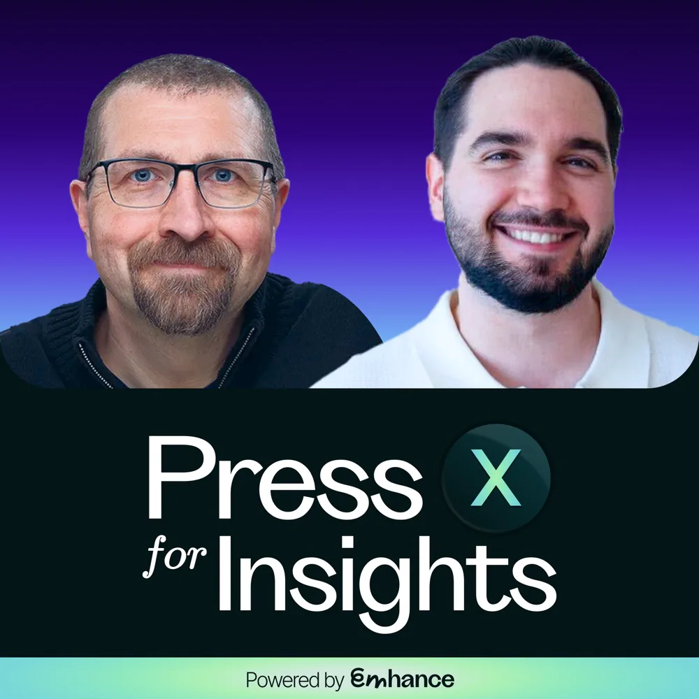
Games research podcast
Identity, cover art and episode thumbnails.
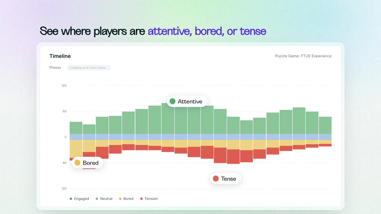
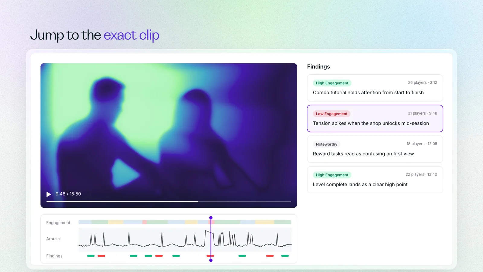
Emhance product in 40 seconds
Built in code from the real product UI, in two edits.
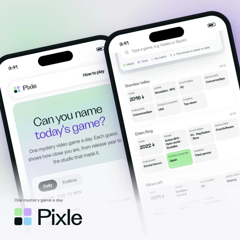
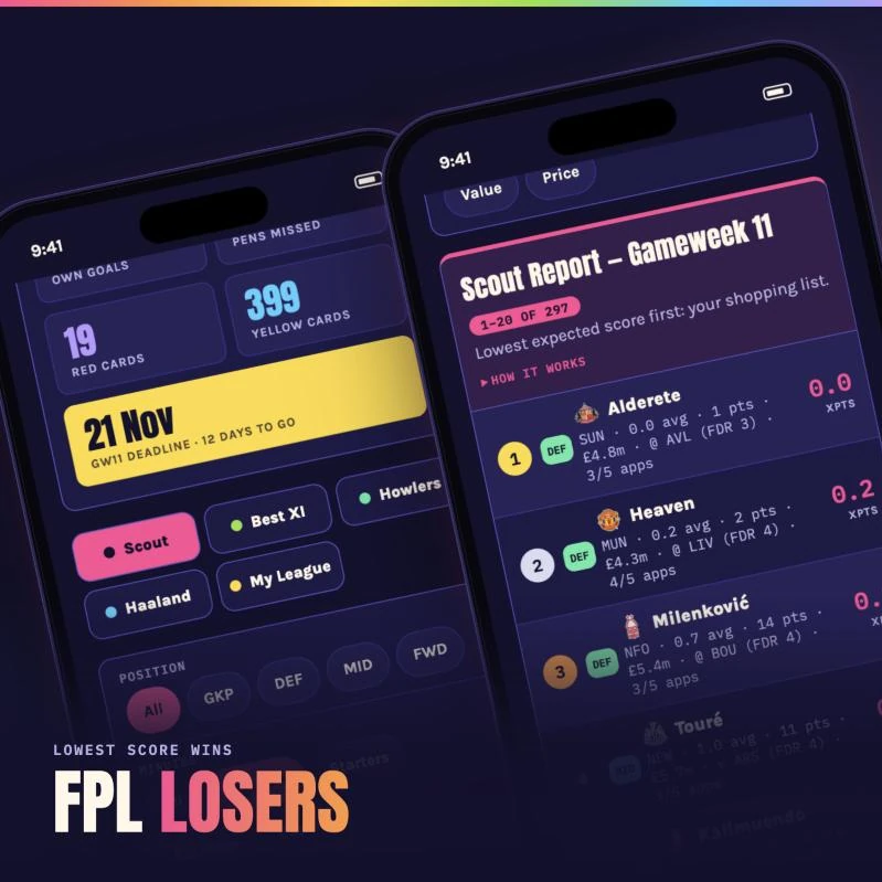
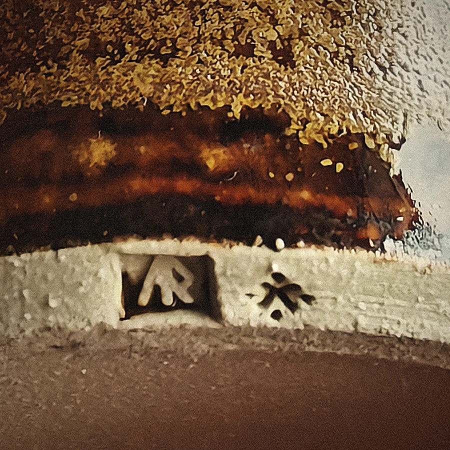
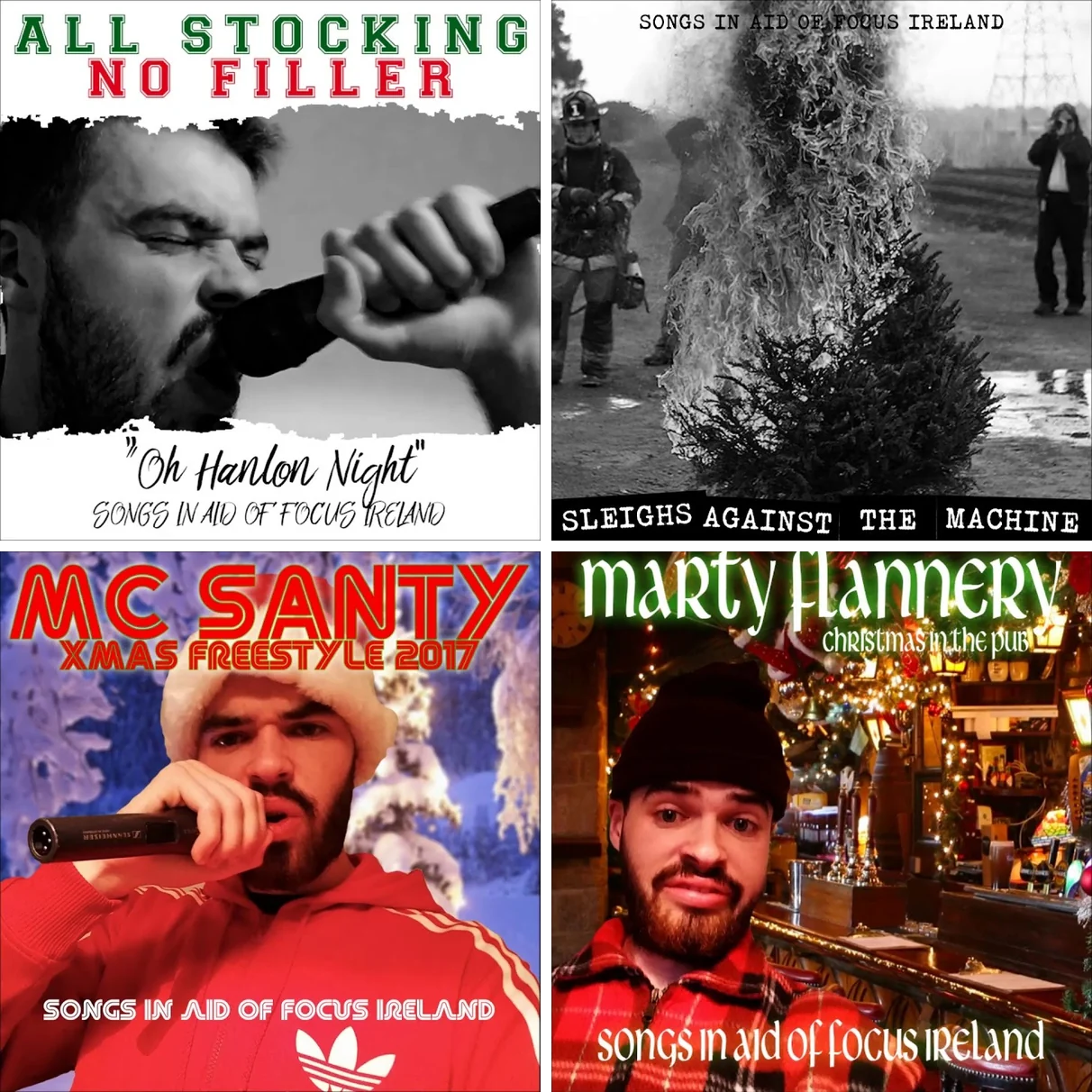
Personal projects: music and artwork for my band, Crome Yellow, friends’ bands and charity, plus a pottery stamp and two small web projects.
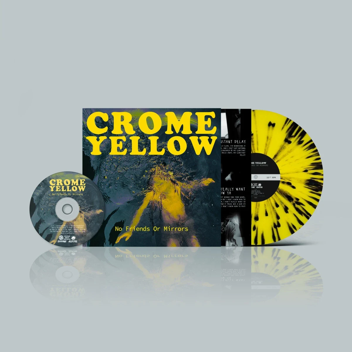
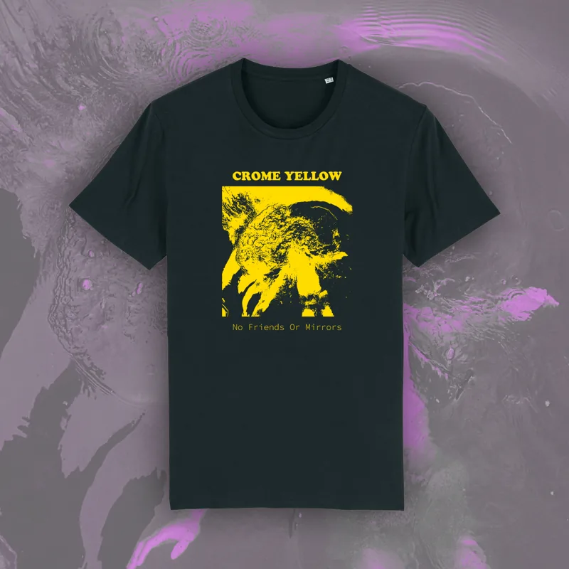
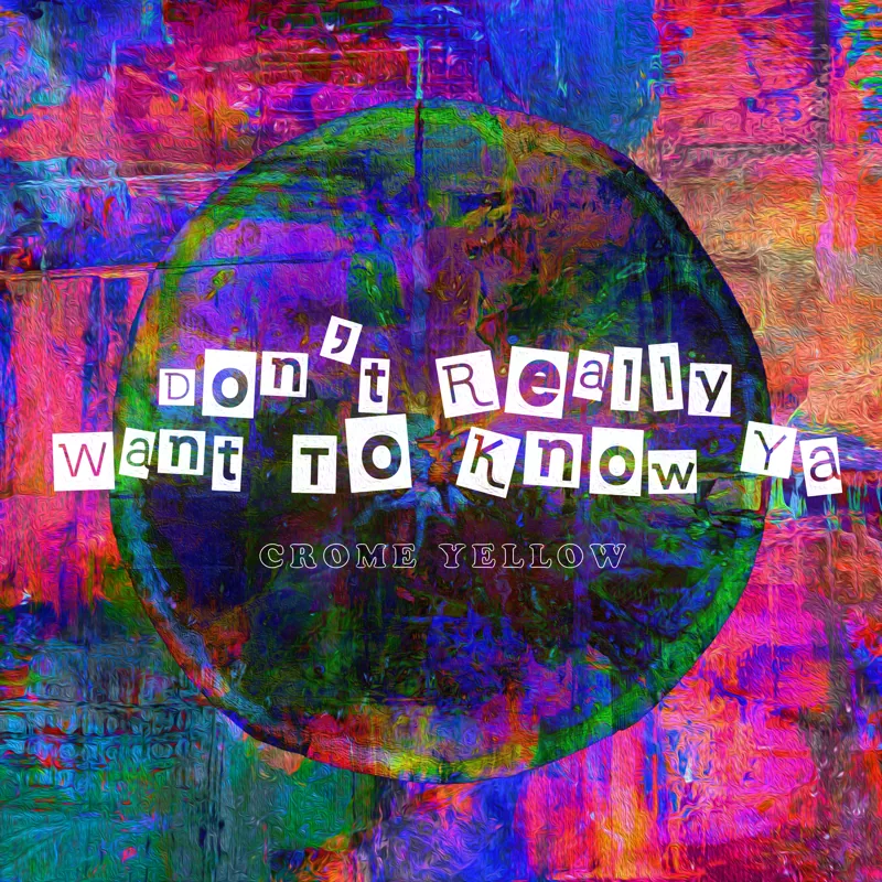
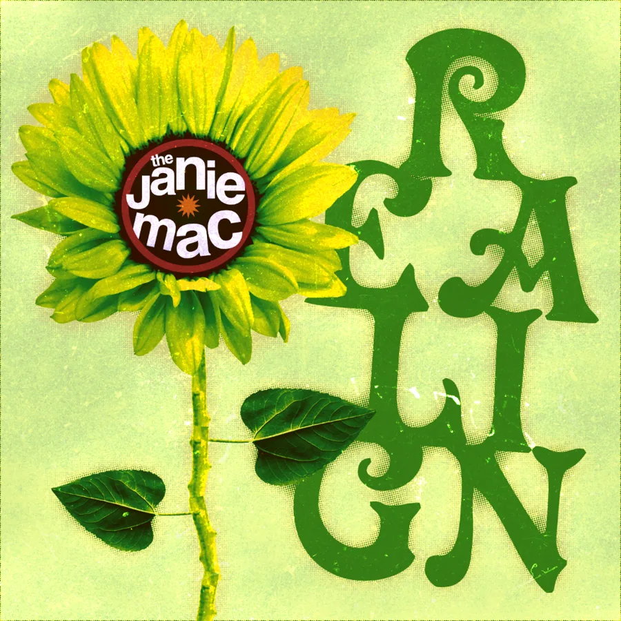

I grew up in Waterford, Ireland. I was always drawn to making things on a computer, and I’ve been producing music in FL Studio and making art in Photoshop since I was 15.
I studied Multimedia Applications Development at SETU Waterford, where I learned web and digital design, programming and audio technology. I started out at Thimba Media, designing banners, landing pages and social content, and producing The Finishing Line, a horse racing podcast I grew to around 1,000 subscribers. I handled everything around it, from thumbnails and titles to the audio and video edit. At Dream Team Gaming I designed three casino brands from scratch, Captain Spins, Casigo and Vegas Lounge, from the logo and website to every email. I then took an MSc in Educational Science and Technology at the University of Twente in the Netherlands.
At OneTwenty I joined as a creative designer and was promoted to design team manager, leading a team across branding, product and marketing. I led the Squawka rebrand and designed the Titan Cards brand refresh for a trading card shop. Since March 2026 I’ve been Marketing & Design Manager at Emhance, a games research company, carrying its rebrand from Sensemitter into the website, campaigns, video and a podcast of its own. Outside work I produce music and make artwork for local bands.